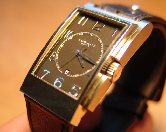
I think this would work better as an advertisement if the DOF were larger to get the entire watch in focus and the fingers holding the watch weren't in the picture.
I like the idea of the photo. Composition works well. The only things really in focus are the 7 and the 6 which is a bit distracting. Greater depth of field would improve this I think. The silvery reflection of the 7 and the 6 (I am sure it really was silvery in this light) is a bit distracting. Maybe filtering the light would have toned down the silver.
I like it how you tried to add the blue accents, but then would have liked to see it more around on all digits. The middle of the clock face shows some irregularities, if that is dirt then it should have been cleaned first. Nice background, matching the leather and gold.
The only problem with this otherwise top-notch shot is the age of the product. The watch looks too old, and takes away from the image as it is now. Also, your fingers are clearly visible. Would be a nice ad shot otherwise, though.
The highlights are a bit too much on this, and there are signs of chromatic abberations.. Using a softer light source (reflector/soft-box/white stocking stretched over a coathanger) and stopping down the apeture on the camera one or two steps would help creatly. You could also de-saturate a shot like this a bit and not loose too much of the feeling, as it's quite a solid image.
I think the watch is turned a little too much to the side. I don't know how much diffusion you used on your light source but I would recommend more to bring the harsh highlights under control. A different colored background would also be nice. the current one is too close in color to the watch face making for a very monochromatic feeling presentation.






 Add photograph to your favorites
 Add photographer to your favorites


 Photographer found comment helpful.


