Author Thread
Post actions
Wow. this is really strong!
Comments Made During the Challenge
Post actions
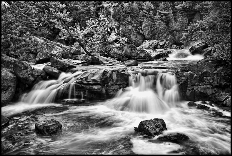
becomes a bit too busy for me in BW
Post actions
Post actions
Location looks great, but the harsh and busy black and white treatment makes it too hard to see what's going on here.
Post actions
Nice contrast and textures. Looks good in black and white.
Post actions
I am a sucker for B/W ... 9
Post actions
I love the high contrast.
Post actions
Post actions
Post actions
I love how the BW conversion shows so many gray tones! Nice.
Post actions
This really doesn't say Solitude & peace to me, its just way too busy. I think the colour may have helped this image
Post actions
The contrast, combined with the "busy-ness" of this scene, make it really hard for any single element to grab and engage me. It's just... there.






 Add photograph to your favorites
 Add photographer to your favorites

 Photographer found comment helpful.


