Author Thread Comments Made During the Challenge
Post actions
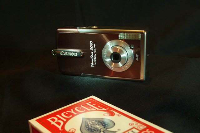
Good idea, but connection between size and product is indistinct without caption
Post actions
Post actions
NIce comcept - might be better without the glare
Post actions
The white on the deck of cards looks pretty yellow- like the whitebalance on the camera was set to daylight but the cards were illuminated with a tungsten light.
Post actions
Nice job. It does an effective job selling quality AND size, so very good tie in to the theme. Image seems a bit noisy to me.
Post actions
The idea might have been more effective if you actually showed the whole deck of cards. This lighting is too dark.
Post actions
Post actions
This is just wonderful. Many will crticize the cropping but I am comfortable as the eye has no other place to go. Perhaps a little sharper focus would have placed this image at the top of the heap. Good composition.
Post actions
This is a bit dark, the camera disappears on the left edge. Nice idea and execution, though.
Post actions
lol...great photo goodluck








 Add photograph to your favorites
 Add photographer to your favorites


 Photographer found comment helpful.


