Author Thread
Post actions
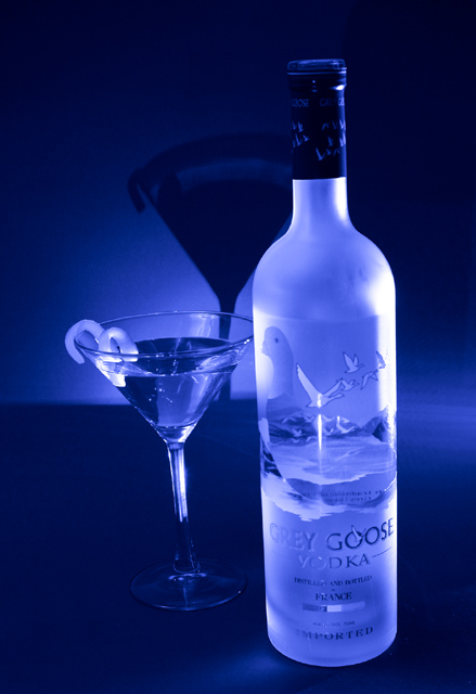
Interesting lighting and lovely blue tones in this
Comments Made During the Challenge
Post actions
must be a winner, but strange background bahavior
Post actions
Blue always does very well in DPC :-)
Post actions
Post actions
Nice colors and good use of the blue light. It would be much better if it was not tilted.
Post actions
Makes me want to try some and I'm a rum girl!
Post actions
Post actions
Mmm.... Grey Goose! I find the shadow of the glass behind distracting, especially since there's no shadow on the vodka bottle. Nice lighting, though!
Post actions
Post actions
nice photo, but just a bit crooked 7
Post actions
I love the blue tones captured through the entire picture Nice, clear focus throughout. The bottle and glass appear to be leaning to the left. Maybe a bit of rotation would have helped.
Post actions
Love the glow color and the shadow in the back.
Post actions
This is a lovely picture. I might have moved the shadow away from the bottle just a bit. As an advertisement, the only problem is that part of the Grey Goose logo is difficult to see.
Post actions
Leans to the left. I like the blue lighting, but I don't like the shadow.
Post actions
Great colors. Is that in the lighting?
Post actions
Nice. But...there is some tilt in the shot.
Post actions
I like it, nicely done. The blue coloring gives it that "cold drink" feeling.
Post actions
nice pic, but slightly slanted. a simple straighten of the pic would have made this picture great.
Post actions
Good idea, but in my opinion there are a couple of things that would improve this shot. First I think the slightly tilted camera makes this look funny- I would rather see the bottle and glass vertical. Second, for an advertisement shot, I think a little highlighting of the name on the bottle is appropriate. The "grey" and the "vodka" sort of blend into the bottle and are hard to read.
Post actions
The bottle and glass look tilted. Otherwise, very good.
Post actions
The blue background really sets the mood. Too bad the bottle and glass look tilted a little.
Post actions
Dang -- so very close to a 10, but you can't read the label, and there's a very hot highlight down the middle. Sell the product not the prop, glasshoppah.
Post actions
I love the colors in the picture. its hard to see the words on the bottle for the advertisement
Post actions
Post actions
needs to be straigher unless you've already drank some
Post actions
Nice hint of blue.....i like it.
Post actions
would be better a bit straighter...but still a nice shot
Post actions
Wow, beautiful. Ony one thing...is the glass tilted????
Post actions
Nice cool looking picture. Like the shadow. I think it is slightly tipped to the left however. It would be better straight up. I still give it an 8.
Post actions
Excellent picture, very good Incident light.
Post actions
Very cool effect. Would have prefered bottle perpenducular, but otherwise a fantastic shot.
Post actions
I like your idea and set up here. The little fruit twist in the glass is a nice touch. Maybe you meant to, but I think the bottle and glass seem tilted to the left. Sometimes that works, but in this case I think it might be better straightened out.
Post actions
a bit tilited -- you've capture the mood with the blue monochrome.
Post actions
Beautiful shot with nice color. It would be better if it were straightened out a bit and if I could see the name of the vodka more clearly, but it's a very nice shot.
Post actions
Perfect, the lighting, the message, the only problem I have with this images the tilting. A 9!
Post actions
I agree! I like the "ambiance" of your picture... Well done! a9
Post actions
Supurb photo, but It looks like somethings crooked or slanted, i guess just an optical illusion from the shadow- but it's a tad distracting. Other than that, great






 Add photograph to your favorites
 Add photographer to your favorites

 Photographer found comment helpful.


