Author Thread Comments Made During the Challenge
Post actions
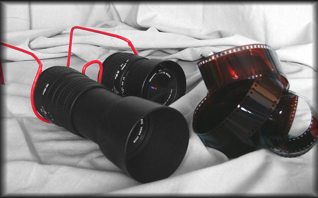
geat exposure, composition, etc, but dorky - not sure where it's going or what it's selling, title only confuses issue more
Post actions
I don't get it. What's the ad for?
Post actions
I don't get the "don't look at the negatives" part of the caption.
Post actions
I don't get it, but that doesn't make it a bad picture. Nice image, probably a good ad for the target market :) A little bit of graininess.
Post actions
sorry, I find the border really distracting
Post actions
Great idea, dosen't seem to have a crispness about it. Maybe you had to alter the contrast a bit to much. Great Title.
Post actions
I don't get this at all. What is the product? The background cloth looks like an unmade bed. If the product is the lenses then they should be in sharper focus and the brand name should be very prominent. The negatives are in even less focus then the lenses. I have no idea what the red wire thing is supposed to be.





 Add photograph to your favorites
 Add photographer to your favorites


 Photographer found comment helpful.


