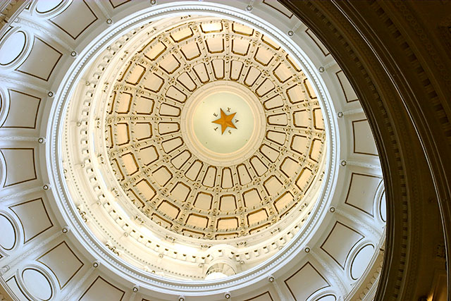
Interesting idea. I've seen this shot done better, though (on DPC). I guess the intention was to get the star centered in the frame but the result seems to be the dark portion of the building at the right that makes for a weird composition.
Very nice composition! Would have liked to cee the central star/logo more prominently, but I guess you can't do that without losing some of the composition.
Very nice lighting, focus and contrast on the dome. I find the dark area a bit distracting but in many ways it enhances the crystal clarity of the dome so I guess it works out okay. Without the title, I would not have known what you were advertising.
as a fellow texan, I love this picture.. but I know I've seen it before (or one that's very, VERY similar). I'm not sure if it was here, or in a magazine, but I definitely have seen this pic before.. Hmmmmm..
I think this is a really awesome shot. A good print even. I get your idea and I think it does fit the challenge, but if I was running an ad campaign for Texas tourism, I don't think I would pick this. The composition is great. Still a good score, just could be higher. :-)
This really looks like way too similar to Gordon's photo (here), but I like it a lot, and it definitely brings your eyes right to the star, and Texas. 8.







 Add photograph to your favorites
 Add photographer to your favorites


