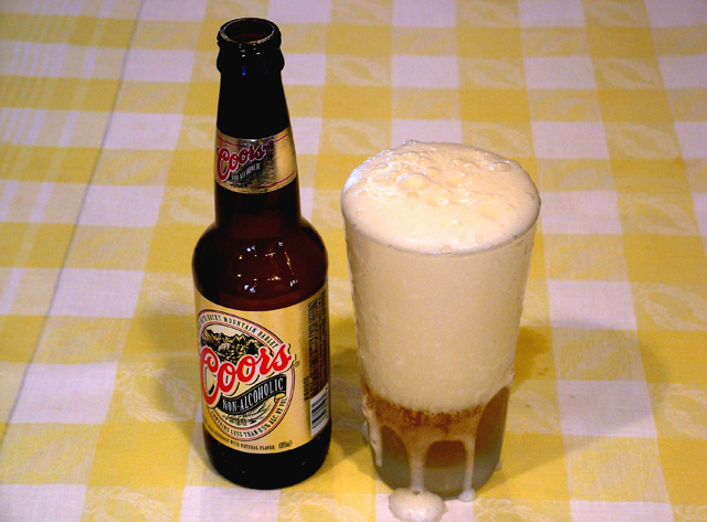
In my opinion this looks rushed because of the overflow of the foam. I think the shot would have had more appeal it you used a warm beer and a frosted beer mug and a slow poor. This way as the beer warms the glass up the beer would have a crisper look to it. Aslo a warm beer so the bottle doesn't look sweaty. Bottle alone was a good shot but the glass made you lose marks.
A good idea but fails to appeal as an advertising shot. Its the table covering that lets it down. Adverts usually have a strong studio feel if shot indoors.
The image needs more lighting to offset the shadows or to send the shadows off into one direction. The background is also a little dull and could use a little sprucing up with something else that enhances the refreshment concept.
Too much head. I also think this would of looked better with a different background. Maybe in a bucket of ice, or a snowy stream (I know hard to do in summer). Something that said cold and refreshing though.
okay i get the safe, but sane? I feel like there is too much yellow in the picture... yellow beer, yellow label, yellow tableclothe. a solid background might enhance this picture






 Add photograph to your favorites
 Add photographer to your favorites


 Photographer found comment helpful.


