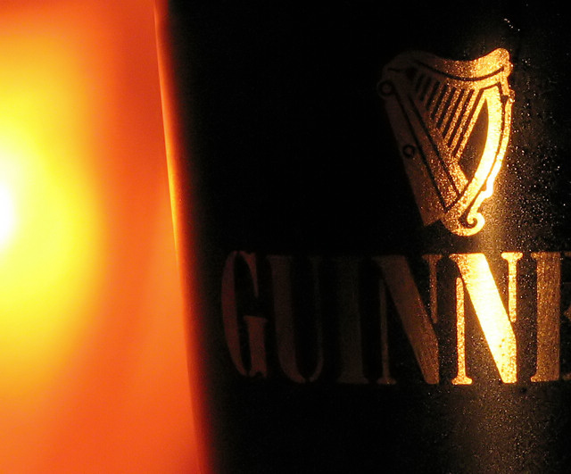
Cool image! It's a little contrasty, in that the highlights are blown out slightly, and the shadow detail on the guinnes label could be slightly lighter. It is instantly guinnes though.
Do you know that when I first saw it on the screen at work, I jus saw the "N" and didn't know excactly theat ad was for! So, good but perhaps too much contrast.
Excellent! Best one I've seen so far. Getting the saturated glints just right while still having the darkest letters legible must have been quite a trick.
One of the stronger images in the challebge - and actually looks like it belongs on a page, TV or billboard. The light on the left is too strong though and I feel that a tighhter crop on the glass would bring the eye towards the product more.
I like the choice of colors and the contrast. Reflected light is powerful. I think a little more light from the left and possibly from behind the camera would have lightened the rest of the brand name a bit and possibly have improved it.
Guinness? I think one of the first rules of advertising is make sure the product name is visible. I'm just guessing this is Guinness based on the gold and black.
i would love this if perhaps a reflector was used to bring some light into the darkest area of the photo - the right side of the U and the I are almost completely lost. Otherwise, nice close-up, detail, sharpness and color. (display recently calibrated with OptiCAL)
I love the golden glow. It gives a great feeling of richness. Nice cropping. I would have been tempted to show the entire logotype but it's still recognizable and a perfect choice.






 Add photograph to your favorites
 Add photographer to your favorites


 Photographer found comment helpful.


