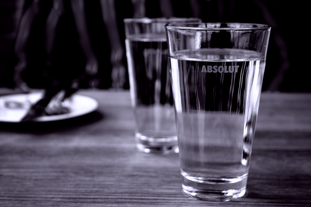
The right half of the image is terrific. Great reflections. Great contrast. Great focus, DOF, and composition. But the left half of the image detracts. A different crop would have improved this dramatically.
The blurry place setting in the background isn't too attractive. There is an area of blurry verticals just beyond that that I can't even figure out. The water isn't presented in an appealing way. It looks rather stale, just sitting there. Perhaps some ice to make it look more refreshing?
I like the idea. I would have cropped tighter on the single class in portrait orientation. If possible, try to get the same texture of dark with light streaks going from the top of the glass to the bottom.





 Add photograph to your favorites
 Add photographer to your favorites


 Photographer found comment helpful.


