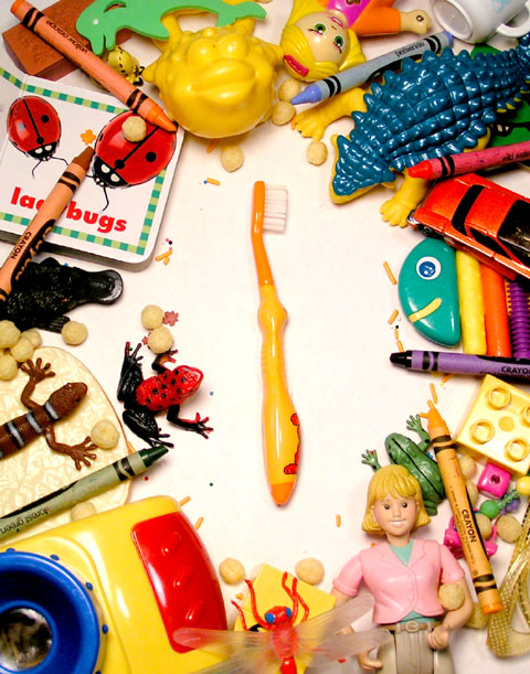
With all the toys in our house it always amazes me how our girls will drop everything to brush their teeth, and sometimes if we forget they will come begging-ly reminding us that it is time to do so.
I have missed the first three open challenges since i have joined the site and wasnt about to miss another one, so i set up a 75 watt bulb and a 200 spot.
I originally wanted to use a black and white toothbrush, just to add somemore monotony to the focal point, but since I had to choose between a white toothbrush or white background, the background won out.
I adjusted the levels in photoshop to give a more contrasty feel to all the bright colors, and cropped out to a mimic a magazine size ad with room to place some body copy at the bottom.
All the toys are my daughters, except the one frog who is working on commision :)
Statistics
Place: 177 out of 218 Avg (all users): 4.2721 Avg (commenters): 3.5000 Avg (participants): 4.0190 Avg (non-participants): 4.4127 Views since voting: 952 Views during voting: 368 Votes: 294 Comments: 10 Favorites: 0
It's a bright and colorful image that would appeal to kids who are its intended advertising audience I'm sure. But it feels like the setup is over lighted. Maybe turning down the lights and angling them from the sides a bit would help. And it's a bit busy for my taste, but it's been a long time since our kid days, what do I know?
I hope she washes that toothbrush before she uses it since it can't be too hygenic after being on the floor of her messy bed room. Or maybe it is a messy table, judging by the cupcake sprinkles. This just looks horribly sloppy.
I see what you are going for here, but I think your product doesn't stand out. It just get's lost with all the other images. I find my eye wandering all over the pic looking at the bright little interesting images.






 Add photograph to your favorites
 Add photographer to your favorites


