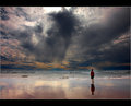
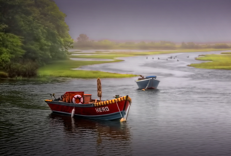
This is a "reverse HDR" image: a flat scene has been expanded using Photomatix Pro and Topaz Detail & Simplify. Uncropped, shot in RAW, processed from single original, gradients added top and bottom, touch of PS Diffuse Glow" to bring up luminance in the water.
ETA: latest version cropped slightly bottom and left.
************
Image was mostly over 7 all week. Got hit with a 1 at 9 PM, dropped below 7, climbed back to 7.0182, lost 4 votes in the scrub, averaging 8.5 :-( Even allowing for those being scrubbed, take away the two 1's and I finish with a 7.06...
Still, better than I expected for an opposite-of-HDR shot :-)
Zone System Rocks!
Here's the unedited, resized original from RAW:
Statistics
Place: 4 out of 161 Avg (all users): 6.9942 Avg (commenters): 8.0667 Avg (participants): 6.8205 Avg (non-participants): 7.1368 Views since voting: 4983 Views during voting: 441 Votes: 173 Comments: 53 Favorites: 27 (view)
I keep looking at this image and at the original one and of course that the processed one has a lot of pictorial qualities.
Nevertheless, the original is more mysterious, more photographic in nature; with the mist and less contrast it transmits an abundance of feelings; the longing is almost unbearable and so is the imminence of some danger (thus the "hero" in the foreground). For this reasons also it might get lost in the shuffle of looking at crisp and colorful images.
My point is that sometimes we push our technology in favor of a quick appreciation and perhaps we shall try on occasion to hold the processing back to a less spectacular first impression and in favor of a subtler and slower evaluation. (i.d. try to make the image with more greys, more mistier etc)
Am wondering if all this rambling is not caused by comparing these two pictures side by side.
Edited for sp
Just noticed this image, Robert. Quite spectacular! Those colors are heavenly!! And the combination of HDR+Simplify very inspired! Making note of this to self..
My goodness, what 2 doodleheads gave this a 1. If people are going to be that silly - we should be able to know who they are - maybe it will make these idiots think twice if everyone could see them on the site. Frankly I thought this deserved a ribbon. Sure the top three were nice but I've seen far too many of the same thing a hundred times on this site.
I would crop about half of the tree on the left side. Cropping is tough, we never want to eliminate some nice details but everything needs to serve the composition as a whole.
Nice image! There seems to be a bit of banding in the sky, and I'm not so keen on the super-smooth, but low-detail look.. For me HDR is all about high-detail! :) Still, a solid 7.
The aerial perspective and DOF is wonderful and I like the rhythm in your title and photograph along with its implied leading line. I find my eye skips along from red skiff to blue then to geese but this compositional element itself is not enough to prevent the image from losing some of its poetry for me. The mood is ambivalent. Colors go from bold to muted, grass too yellow a green, yet sky too drab a purple. The sky appears flat lacking any detail. It looks as though you've used a GND (maybe too strong a one). My guess is you over processed the overall image to make up for the flat available light.
Also, whatever is sticking up out of the red skiff is distracting. One other nitpick is the positioning of the blue skiff. I know you have no control over this matter, but I wish it were facing towards the tree so that we could see more of its port side to serve a better foil to the red boat. Finally, the pink lifesaver is the straw for the camel and really does this image in, though I think a lot of the voters will like it and vote it highly.





 Add photograph to your favorites
 Add photographer to your favorites


 Photographer found comment helpful.


