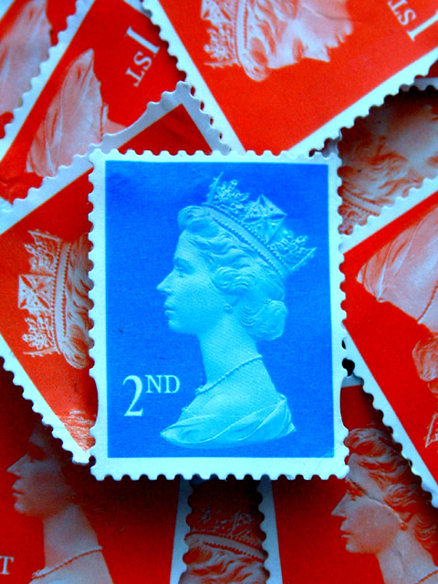
Racking my brain about what to shoot for this challenge, the answer was staring me right in the face while working! Great contrasting colours those first and second class stamps!
Statistics
Place: 30 out of 243 Avg (all users): 6.0395 Avg (commenters): 7.6667 Avg (participants): 6.2194 Avg (non-participants): 5.7551 Views since voting: 1672 Votes: 253 Comments: 28 Favorites: 2 (view)
Mark, these days i don't have the time to submit and vote anymore. However, when looking at the results, your picture grabbed me. I think it's a neat image! IMO, placing the blue stamp dead center was the logical placement choice. I like the composition and the arrangement of the other stamps; the shot has great clarity. My only nitpick is that the light left below the blue stamp is somewhat lacking. Royal blue is the name for a type of English porcelain, isn't it? :) Journey
nice contrast... I think the way you set it up so that the red stamps don't show the full illustration is a great way to take some power away from the red stamps... good job!
~anachronite
Nice conecpt! You used the contrast of the colours very well. Unfortunately some parts of the stamp (e.g. upper right corner) are a bit out of foucs. Also the red stamp on the upper edge of the photo seems to have a lot of grain. However, I like the photo very much because of the way how you emphasised the blue colour by putting it on the red background. -stephan
Very nice. I like the contrast of the blue stamp on the red stamp. Your angle and framing/cropping are great, and focus is very nice as well. Overall a very nice shot. Good luck in the challenge.
Really impressed here by the combination of red, white, and blue. Nice work. I don't know how to explain the composition, because it's weighted a little to the right, but it works and gives a good feeling of depth. 10
Unlike a lot of ppl, I tend to like technical shots more than emotional ones. This is very nice. I like the idea and the execution. It's grown on me since the first time I viewed it.
Great title! I really like this picture. The colors are vibrant and I love the red stamps as background. The only thing is all that red is a bit distracting from the "blue" theme.
Very pretty, I definitely like the picture and the title... Only thing I would have suggested would have been to not place the blue one right in the center. Pay attention to rule of thirds... this would have been much more effective in one of the corners. Great macro though! And very interesting, nice looking subject. Good luck!







 Add photograph to your favorites
 Add photographer to your favorites

 Photographer found comment helpful.


