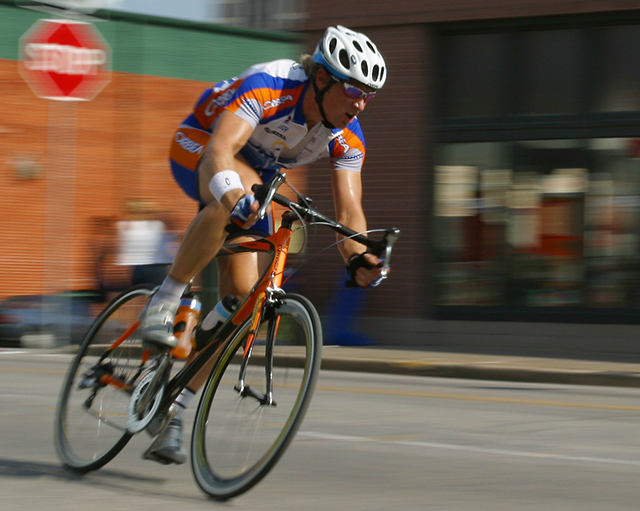
beutifful colors, I'm not sure what is being advertised, however. If its La Carrera, it's too b ad that the name isn't more noticable on his jersey so you wouldn't have to rely on the title of the pict to tell us what it's advertizing
Very good. The labeling on his clothes should be a bit more in focus but I can see how this would be difficult. If it were a real add, the print would avoid any confusion for the viewer but it still wouldn't be perfect. Someone who doesn't know much about the sport (like myself) can not immediately identify what the product is. It could be the bike itself, the brakes, the tires, the helmet, or the clothing.
Still, that is a just a minor nit. This one is quite good.
This would make many a sponsor happy. Their logo in action. The only thing it needs to be perfect is the other cyclists in his dust.. Wee cayght action shot, with a good level of motion blur to give us the feeling of speed.
Excellent shot. I love the effect that you got from panning. My eye is drawn to the stop sign a little more than it should be...not sure why, but maybe because of the "diamond" effect in the focus? I'm not sure you could do anything about it, so I'm not gonna deduct anything :)





 Add photograph to your favorites
 Add photographer to your favorites


 Photographer found comment helpful.


