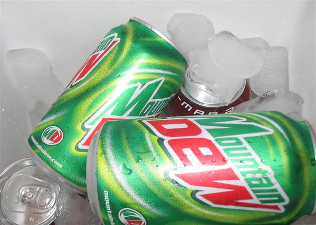
Good concept. Lighting is flat though, with the reflections on the front being too distracting. Also, the ice needs to stand out more from the background.
One can is obviously not a mountain dew, the one that is dark with the m and a visible. You've got a few water drops on the can, more of this would give a more refreshing feeling.
I'd try to eliminate the horizontal reflection on the lower front can. The name of the product should be the most important thing so maybe turn the other can our way.





 Add photograph to your favorites
 Add photographer to your favorites


