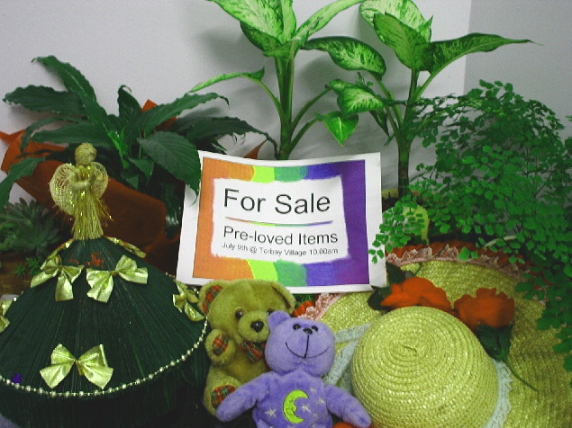
Looks a little washed out, I think if the contrast was tweeked a bit it would help. A bit of fill flash may have helped with the shadows as well. Nice idea though.
I find this shot to be blurry and looks more like clutter then something advertised. I also think there is to much green in the shot and find it to be overpowering.
The idea was to make a photo that looked like an ad not a photo showing advertisement. This looks like what you would see on a yard sale table. Not real appealing product. Photographically, it just seems to be a point-and-shoot snap shot.







 Add photograph to your favorites
 Add photographer to your favorites


 Photographer found comment helpful.


