Hi Olyuzi and Greetings from the Critique Club.
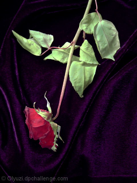
Your entry for the purple challenge Desicated Blush most likley did not score as high as you would have liked. Actually, I am susprised it did not score much higher as it has some very nice qualities.
The colors are superb and work very well together. The purple is very evident and makes the red and green really pop out.
Exposure is perfect.
The lines you've created with the folds in the purple drape accent the red flower exceptionally well. The flower in the dark area around the fold is esquisite.
I think most voters, including me, were most likely concerned with the "unnatural" qualities of the shot. As I said in my original comment - the flower seem lifeless (real or not?) and seems unhappy hanging upside down like it is. You should try the same general composition with more of the flower's "face" showing, then invert it to see how it would look right-side-up, so to speak.
Having said that, I still don't see how your image placed so low - I would have predidicted it would be pretty much in the middle of the pack. But keep in mind there were some VERY strong images in the purple challenge - so the competition was rally strong.
Thanks for sharing this image - keep shooting and entering!
-Tom-
|






 Add photograph to your favorites
 Add photographer to your favorites

 Photographer found comment helpful.


