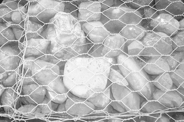
B&W worked against you here - it's so grey it is almost faded into one solid rock. Needed to be in color, and or darker to bring out the individual "pets". PTL3
You know, my first reaction was that this needs more contrast, however, My shot is similar to this, as I have NEVER seen a photo look the same after it's transfered into print for a newspaper. They are always grey, right? I'm getting marked down a LOT for my decision to make the shot look like a REAL newspaper shot, and I wont do that to you. :) However, there do seem to be a few bright spots onthe rocks. Otherwise, nice angle and framing/cropping, and focus seems nice as well. Good luck. ~HBunch7187~
Heh...It's mildly amusing but only because of the title. The overly white rock in the front is the eye catching point which overpowers the rest of the rocks.
Composition: Subject Placement, Cropping, Background8, Technical: Focus, Exposure, Lighting, Processing5, Appeal: Is it Interesting, Motivating, Etc.? 6, Total Averaged Rating6. Autool IMO the relationship between the title and picture are key elements in this challenge. this is way too funny. Where is your contrast?






 Add photograph to your favorites
 Add photographer to your favorites


