This is my second take on this. And I do like it better than the first take. What happened to the first take? Well, a classic error, I didn't double check the date on my camera and it had somehow gotten reset to 2002! :)
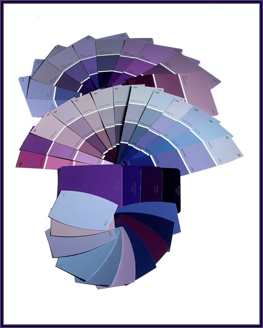
So I went back out (I had let my son play with the other samples) and got more paint chip samples. I told the people in the stores that someone asked me to paint a room purple and then said, "I'm going to show them these and say, 'Define Purple!'" They laughed!
Regular poster board on dining room table
Arranged paint sample/chips
Opened curtains to let natural light in, evening light
Shot several different exposures, about 20 with different settings.
Rotated
Cropped
Magic Lassoed the paint chips
Inverted Selection
Brighten and contrast +100 on white part
Cloned out table and chair part
Cloned out shadows
Inverted Selection again
Slight adjustment to brightness and contrast
Duplicated Layer
Soft Light Adjustment
Adjusted Opacity
Flattened layers
Straightened again
Added border
Resized to 8x10 and the 640 x 512
Ran through Neat Image to take care of noise
And there you have it
Statistics
Place: 95 out of 172 Avg (all users): 5.0443 Avg (commenters): 6.4615 Avg (participants): 5.0300 Avg (non-participants): 5.0583 Views since voting: 1141 Views during voting: 293 Votes: 203 Comments: 14 Favorites: 0
andy warhol hits the home depot. or photography hits all time "lowes" just kidding, creative, colorful and with lots of black and blues- just like i like my women!
Great idea. not such a good composition, the bottom fan off center like that. What if you take the theme of the fans and make it look japanesey. maybe the two top fans set at an angle to each other. Actually I like it better cropped under the middle fan - so maybe just remove the bottom samples? A great statement - this should have been the mandatory first photo for voters in this challenge.
I like your idea & choice of subject, I maybe would have left out the samples on the bottom. also, I'm just not "moved" by the layout in general of the samples... maybe a closer view or a more dramatic angle, playing w/ the focus... something just to make the image unique and different.
a nice clean shot, the perfectionist in me would have preferred the lowest blues to be more symmetrical to the rest of the picture, but that's just me !
This certainly suggests or depicts purple! Any reason the composition is not centered and slightly to the left? Also, I'm not sure if I like the layout of the bottom 2 swatches (single color cards). Would have been nice to have a consistent pattern.








 Add photograph to your favorites
 Add photographer to your favorites


 Photographer found comment helpful.


