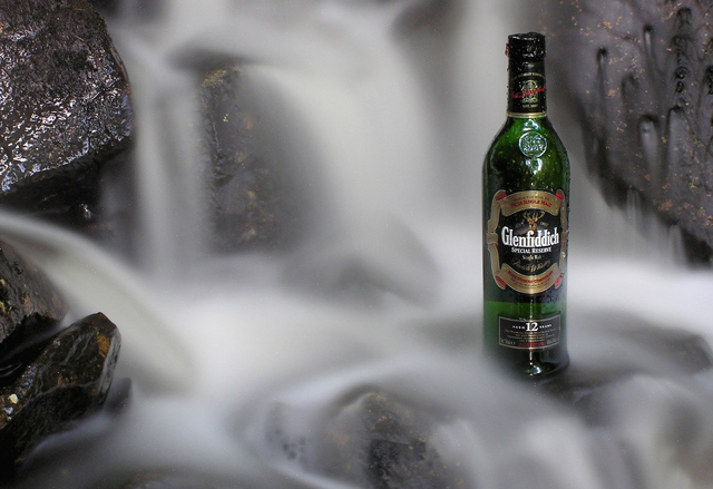
A simple depiction of Scotland's most famous export. I chose Glenfiddich because of the attractive bottle and the contrasting colours. There is a problem though - it's a triangular shape and it was virtually impossible to eliminate reflections in this natural setting. The other problem was avoiding the accumulation of water drops on the bottle. In a professional shoot I would have had a huge screen, lighting and an asistant to look after the bottle!
Shot in the burn that runs past my parent's house on the Isle of Skye.
Great job, I love the contrast between the movement/stationary, white/dark, rock/glass. The only problem with that I see in it is that bottle in it. No, j/k. Excellent shot.
Hi everyone. Wow! Thanks for appreciating the photo.
We are exposed to a lot of high quality editorial imagery in advertising in the UK and as I was in the isle of Skye, a natural setting seemed a good idea. I saw the wonderful Glenfiddich bottle in my parent's kitchen and decided to use it.
Key to advertising is focus on the product or on the imagery associated with the product. Hence the choice of a natural setting (whisky being a natural product) and the long exposure (16 seconds) to provide the muted but sensuous background. I tried setting the bottle in seaweed and on rocks (Scotch on the Rocks) but it was hard to take a shot that didn't just look like a bottle of whisky sitting on a rock. Hence again the need to do something to the background within the constraints of basic editing.
The bottle is not as sharp as it should be. Perhaps this is due to 4 megapixels and the accumulation of water drops from the waterfall. In a pro shoot the bottle would be shot at 1/250sec or so in same setting ans superimposed in photoshop.
Key to this shot was a tripod. Everyone should have one. Other key thing was a 4x and an 8x neutral density filter. These reduce the light entring the camera and allowed a 16 sec exposure at f7.0. ND filters are an excellent piece of kit allowing long exposures in daylight conditions.
Glare on bottle was not result of flash -none used but the ambient light penetrating the woodland canopy. On a triangular bottle this gave a lot of problems (I've edited most of this and excess water drops out on the print for sale). Ont he comment about neatimage - not used. This is a simple shot using only a long exposure.
Thanks again for all the comments and congratulations to the other ribbon winners.
I love Glenfiddich.
This photo is also excellent. Not sure if the water is perhaps a bit too blured from the long exposure, but still looks pretty cool
A really wow! Perfect shutter speed for the water. The only thing I don't think works is the rock(s) in the left bottom corner. Exposure could not be better. This should finish way up in the strosphere.
The slow shutter made the waterfall look just right for me; as such it suggests the smoothness of the Scotch. Basic editing kept you from making this an Excellent image as the flash highlights could have been cooled down otherwise. One of my favorites!
What a neat effect.. Be interested to read your comments after voting closes. I assume a longish shutter, and some flash fill which gave you the highlights? I prefer something a little older in a scotch, but a nice drop all the same :-).
I could easily see this in a magazine..very professionally done.
My only concern is that DPC had some sort of ruling against alcohol and cigarettes being portrayed in images which, if that is the case, may knock points off with some folks.
For absolute perfection substitute.. Glenfiddich with Glenlivet :).......9
You've sold me! If this doesn't ribbon I don't know what will. This is an awesome shot with great composition and exposure. The water almost looks like smoke or mist flooating around the bottle. Well done (10)
Makes me want a glass right now (and it's early in the morning too....), Great job mixing a "traditional" waterfall shot with advertisment element. I'd think this one should get a ribbon.
The water is wonderfull, for this shot though, i thinkk i would have gone for a warmer light. Evening or morning light would be great i think. Right now, itloosk a bit cold IMO.
The blurred moving water works very well in this one. To me this is one of the best ones here because it looks like it could be a real ad and not just a picture of something somebody did in their kitchen. I like the color and the lighting too.
Excellent idea. I'm assuming that the thought is the water is very smooth and therefore the beverage must be too. However, the long exposer and low lighting make the water seem overly grey. Highlights on the rock and bottle are a little troubling too. Perhaps with a brighter more diffuse source you could reduce the highlights and brighten the scene overall.





 Uisge Beatha - The Water of Life
 Add photograph to your favorites
 Add photographer to your favorites


 Photographer found comment helpful.


