In another challenge, this would have been top 3 -- it's really got an amazing feel to it. I think it's a slight stretch on photojournalism, but one I'm willing to make for such a great photograph.
FIRST IMPRESSION: Nice setup...would make a fairly nice xmas card. :|
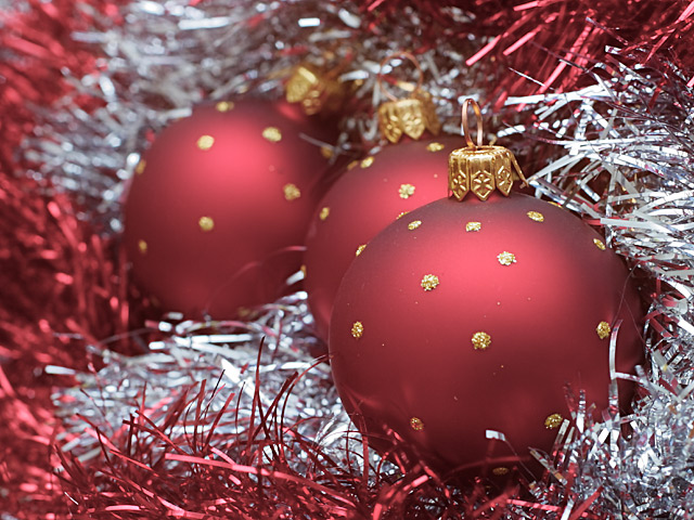
COMPOSITION: Great...what else could I say...If anything, I would try and get the far ball to be surrounded by the white 'thingies' so that it doesn't look like the red comes from center left and leads to the front ball (squint your eyes, you'll see what I mean)...but this is me just being too picky :)
TECHNICAL: Beautiful focus on the front ball. The softness of the back balls work beautifully. Lighting is perfect, in my opinion. Now, how the heck did you get such great 'smoothness' with a 30 sec. exposure...I guess having a D60 helps :)
ARTISTIC: Like I said, it would make a nice xmas card. Nothing spectacular in my opinion, i've seen similar shots a few dozen times...but that's just me. :(
OVERALL: A well executed photo of a somewhat boring subject. I'm not familiar with Vogue Magazine, so I really don't understand your title. In my opinion this belongs on a personal xmas card or with an ad of some sort...not the front page of a magazine or paper...sorry, Gord :(
Half out of focus - doesn't add anything to this. Would have been "pretty picture" otherwise. Nice color choice. Decent composition but not a very good execution. Of course this is my personal thought. PTL4
High quality shot. I like it. Excellent color. I can tell a high end camera shot when I see one. I see quality lenses written all over this. 8 nards656
I'm a big fan of DOF, and this is great. The detail in the garland is wonderful and the lighting is right on. I actually kind of like the flaw in the hook part of the front bulb...not really noticeable but it's there if you look at it. Great setup shot. muckpond
A seriously good photograph. It has almost nothing to do with the photojournalism that I would so call. However, I can genuinely believe that this could be an -- at least inside -- cover for something like Vogue. So ... My top pick this week. Jak 9
Well we know this is your image Gordon and I must say I like the idea. Not crazy about the composition but christmas is worthy of the news at this time of the year. The middle ball looks out of place.. maybe if its bottom was sticking out a little bit more. Anyhow I think everyone's image should remain anonymous and since your image won on another website it leaves it up for discussion.. and that's not necessarily right either.
Great technique. This would work for christmas cards. Nice color choices and great dof. Good job controlling the exposure. Those shiny tinsel things can be tough. ~indi
I like this photo. The ttle wouldn't really be appropriate for a monthly magazine, but rather for a daily, since you are counting days here. But back to the photo....I like it very much, but it seems to be more appropriate for a card. The colors are nice and I like the composition. The dof is ok, but the more I look at it, the more I'd like to see the entire image in focus. My eyes just follow the balls back to the rear one, and if it was a clearly focused as the others it would be more pleasing, in this case. Not that I always want to see the whole pic in focus, just in this one. :-) Good luck in the challenge! Grayce aka Gracious







 Add photograph to your favorites
 Add photographer to your favorites


