Author Thread Comments Made During the Challenge
Post actions
has a good feel - would inspire a good copywriter
Post actions
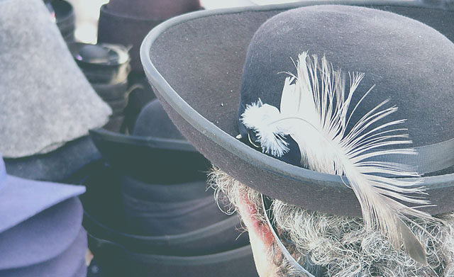
Original and well observed. Nice composition. Maybe some more contrast and saturation would have improved the impression. Anyway, - I like it!
Post actions
Needs a lot more contrast. Also, I just don't get it. How would this be an advertisement?
Post actions
Would be much better with a little more contrast.
Post actions
very contrasty. lacks saturation.
Post actions
Contrast isn't right for me... other than that the hair under the plume looks just like my beard.
Post actions
A little washed out, but a great composition!
Post actions
Post actions
Needs to be sharper and a little better focus? Maybe a color feather? Does not not grab me and make me interested in the hat.
Post actions
To overexposed so it has lost a lot of its crispness, Maybe play with the contrast a bit more.
Post actions
The title doesn't sound much like advertising copy. I don't get it. The photo is very washed out and drab. If the hats are the products, they don't look attractive enough that I'd want one. For one thing, the hat on the person's head has grit and lint in the brim. The person's grizzled, dry, grey hair isn't too lovely either.
Post actions
Contrast seems a bit dark. Nothing overly interesting to portray the hats though.
Post actions
try to adjust level a little...
Post actions
The images is overexposed (my monitor is very preciesly calibrated), and lacks a punch.
Post actions
this is so washed out, it makes it hard to focus on the hats.





 Add photograph to your favorites
 Add photographer to your favorites


 Photographer found comment helpful.