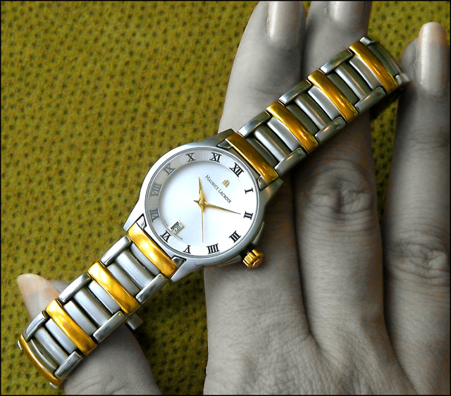
Ahh - the watch itself is superbly displayed and lit. The backgrould would be far better if it were a solid black - this one doesn't do it justice. Your model's fingernail colors don't help a bit. Even with the flaws mentioned - it's an excellent advertisement image.
Liking the techniques used here to desaturate the skin tones, although there are distracting blotches here and there. Also 7-10 o'clock on the watch appear 'smudged' which distracts.
Overall a good shot, Pity the numbers on the left are kinda fogged over and not sure about the colour of the hand especially the nails! Good background and overall clarity.
Great composition..the watch on the diagonal works very well..superbly lit and very sharp..the desat has let you down a liittle as there is still some colour in the hands and on the nails..but overall the image works very well as an advertisement
Wow, what a beautiful shot. This could be an actual ad. I think a solid background might help the watch stand out more, but I like the photo as it is as well. Very nice job!







 Add photograph to your favorites
 Add photographer to your favorites


 Photographer found comment helpful.


