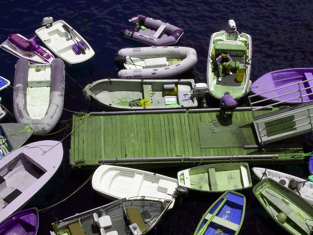
What a fun shot! I gave you one of the 10's on this. This is screaming with colors. It's clean and well focused and the green really makes the "PURPLE" stand out. I really like busy shots (And I know I am almost alone in that regard). This is just a feast for the eyes to browse through. I really like it!
great, fun shot! I love the colors and the feel. Very crisp and great lighting & composition. great job! The ONLY thing i might change would be to try to get the dock to be 100% flat on the horizon line (180 degrees). Other than that, it's great! I didn't vote in this challenge actually. I wish I had. My shot didn't do very well, shows me for getting creative with my lighting haha!
This is one of my favorites - I disagree that it is too busy - I think all the boats become not boats but parts of a pattern and that pattern is what makes to image interesting.
An unusual angle and some very purple's here and there. Overall it seems a bit busy for me - I think a better image would include only a boat or two... For example, I'd like the purple boat in the bottom left corner along with the lilac one above it.
the darkness of the water is out of balance in relation to the other colors, which suggest bright sunlight, and no reds; it makes me think that you did quite a bit of color altering with software, the image has lost too much realism
Interesting use of color. A bit too many boats make this image too busy. The pier is also slanted very subtle and should either be horizontal or deliberately skewed. My eyes want to focus on the pier because everything else is chaos.





 Add photograph to your favorites
 Add photographer to your favorites

 Photographer found comment helpful.


