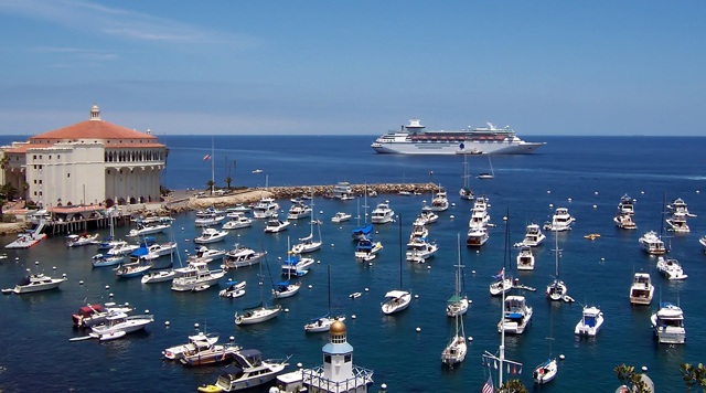
This is a slightly bland shot. I think perhaps less of the smaller ships, more of the big ship would have improved your "ad" a bit - more dramatic and a better selling point. Still, I like the colors that you captured in the water.
This photo/advertisement seems like a stretch. I wish there was more of a reference to the California Lottery in the photo, itself. This is a great photo, though.







 Add photograph to your favorites
 Add photographer to your favorites


 Photographer found comment helpful.


