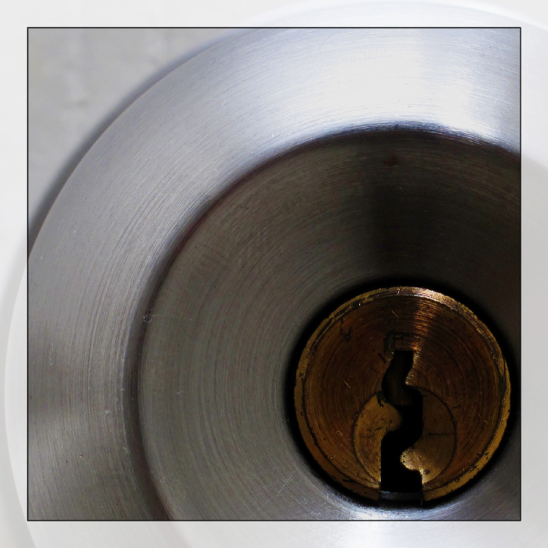
Interesting as a graphic. I really like the circle elements, but IMNSHO, the mid-right could do with some dodging. It seems to sink into the background.
Different, crop a bit too tight in the right of the bronze circle, would have kept the same amount of silver as under the bronze on the right too. And a bit more lighting on the bronze circle a little dark in the center. Nice though.







 Add photograph to your favorites
 Add photographer to your favorites


 Photographer found comment helpful.


