I believe I understand your intention on this shot...
Composition:
I don't find anything seriously wrong with the composition of this photo... the angle looks fine to me.
Technical:
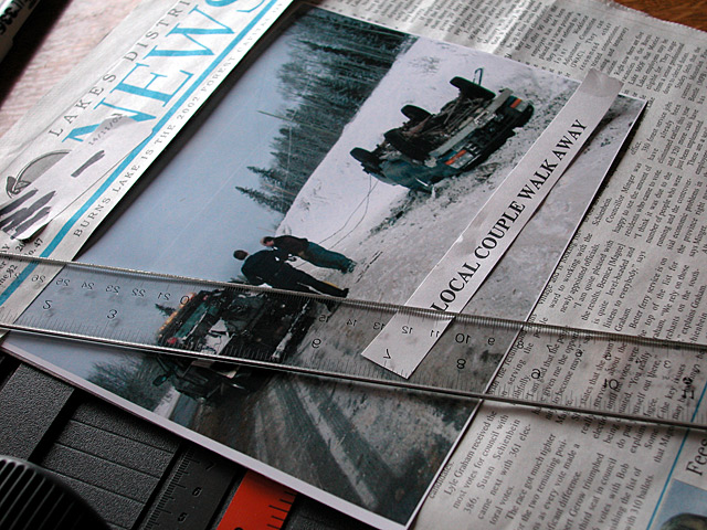
Once again, I don't see much to complain about technically in this photo. In my opinion, a newsroom copy layout editor workspace would be brightly lit. This particular image seems a little on the dark side for that. Maybe adding some extra light here would have improved the overall image somewhat.
My Thoughts:
I read through the comments you received. The comments you received here don't really help qualify your finishing score very well. Two people showed you high scores and the rest didn't really jump for joy :)
I believe that your photo may have suffered in two areas. This photo is a 'photo of journalism' and not really a photojournalistic image in itself. If the photo that is visible in your shot was your entire image, I think it would have been a much stronger shot overall. The second issue, in my opinion, is that the photo does not produce enough 'wow' factor for the viewer. What I see here is more of a still life photo. The photo itself doesn't seem to contain any action or any other real mechanism to attract and keep the viewer's attention for a long time.
If you have any questions or comments about this critique, please feel free to contact me via my profile page here on DPC :)
While the image is technically not bad, sharp with good definition; I find it to be univoleved in the subject matter, with a lot of extra ements in the compsotion that distract from the subject.
I looked at this long and hard..It interests me and bugs me at the same time. :) First I wish the ruler was out of the way. I want to see the tow truck plus I don't see a reason for it being there. Okay that said................I really like this shot, it's creative and clever!! Justine.






 Add photograph to your favorites
 Add photographer to your favorites


