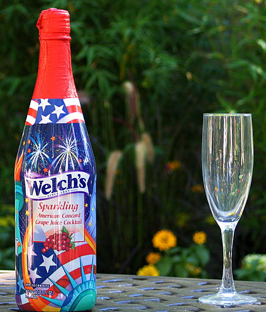
The glass looks dirty, and I think it would look better if they were evenly spaced (distance from the bottle and the edge = distance from bottle to glass).
I don't like the emtpy glass here. Plus, the glass isn't as clear as I'd like, it looks somewhat cloudy/dirty. I think this would have been more effective if the glass had been full.
Perhaps the glass could have been closer to the bottle and filled with the sparkling juice for a tighter shot. Cool design on the bottle, makes for a nice selcetion for the challenge.
Interesting colors reflected in the glass. I like the product placement, but I don't understand the composition in terms of the 4th of July packaging, the somewhat formal style of glass, and the floral backdrop. I guess the 4th theme on the bottle is what throws it off for me.






 Add photograph to your favorites
 Add photographer to your favorites


 Photographer found comment helpful.


