|
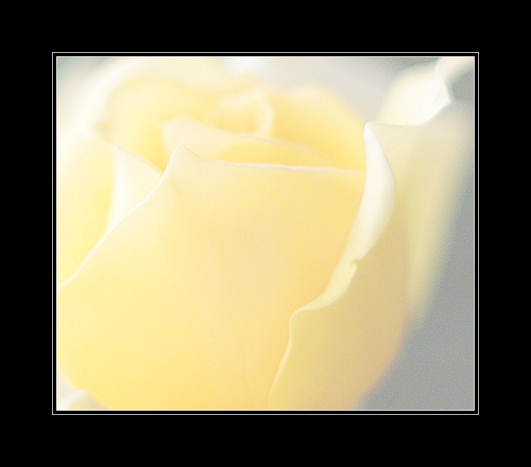
I like the shot, but for me the border is overpowering- When it first pops up on the screen it's hard to see the beautiful lines and subtlety in the flower at first because of the sharp contrast. The voter's first impression is a blob of white surrounded by a sea of stark black (people are rushing through :( ). I'd recommend a much lighter border. I won't vote it down for that, but wanted to let you know. Good luck in the challenge! |






 Add photograph to your favorites
 Add photographer to your favorites


 Photographer found comment helpful.


