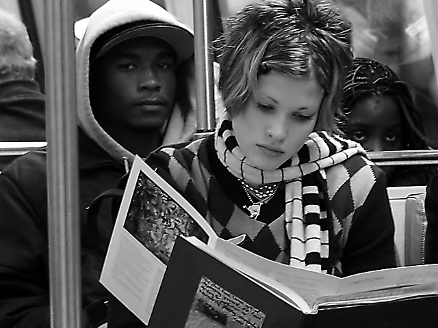
My first impression when I saw this image is that it is cropped a little too tight. I'd like to see some head-room above the subjects. Aside from that the composition is good, including just enough background. Looking beyond that I see two beautiful teenaged faces, and a kid peeking over. The faces are a pleasant subject and you successfully managed to expose different skintones beautifully. . That is a difficult thing to do...good job! The dark skinned young man is partially shaded due to his visor and hood, but that works just fine. Post-processing worked out ok. I think it was a wise choice to remove the grain. I should have done that with mine. Overall it's a good picture, and would fit in the newspaper. Grayce
i agree with tim that grain is accepable lots of kinds of shots, but this is dpc we're talking about : ) .. So I played it 'safe'. anyway, here's the shot without noise reduction added.
I think I would have left some of the grain in. Grain in candid or photojournalistic photos is acceptable. As iit is there is some plasticity that I find a little distracting. The photo is very successful, however, in large part because of the black male who's looking straight at the camera contrasting with the beautiful white female who is absobed in her book. Even the little girl seems to be looking at the camera. There is a lot of visually contrasting relationships in this photo to make it very effective as a black and white. I think it is cropped just right with just enough information included to show these people in their environment. I love photos like this because it makes me wonder what everyone is thinking about and I start to imagine a story about them. Technically, I think it could be a little better but it is still a very engaging photo.
i just took it.. im pretty bold with the stealth (oxymoron?) : ) .. my only own personal gripe was that i had to shoot at high iso and it was sharp but grainy. so i ran it through a noise reduction and it made it really soft and weird.. sharpening just made it more weird. still i think it would have done worse grainy. :P maybe i'll post it ..
great shot mag... it kept getting better each time I saw it... curious, did you ask for their permission to take the photo? or did ya just shoot it? let us know... thanks! ~jeff
Nice composition. Could have stood alittle more exposure. Man's face has too many shadows, IMO. I still like the shot very much. Captures the essence of the challenge.
Over sharpened jumps out at me - her hair, scarf, and brochure & book. Like the little girl behind her on her left. She almost looks afraid and the guy with her looks suspicious of you. Great depth to their eyes and expressions. Good photo just wish you hadn't sharpened it. Maybe lightened and adjusted the contrast instead. I try both to see which is better. Just my thoughts. PTL6
I been caught shootin' man. Looks a little oversharp from where I sit, and could use just a touch of + gamma. Then again, I like the way the guy's face looms out of the blackness in his hood. Nicely done.
The expressions on the faces are great, the whole image makes a point. While I think the contrast might have been pushed a bit too far, it does not take away much. Very well seen, congratulations!
Congrats on an excellent photo... I love the composition... the guy with the hood 'makes' this photo since he's looking right at you. That's a great catch :) I'm giving this photo a 10, but I still have some issues with the overall image quality. I'm not sure what my issues here are, but the image could possibly oversharpened. Something just looks a bit strange about it. Maybe the contrast is a little high also? Contrast is important to me in a b/w image though... great shot :) - setzler
I'm not sure how you mean about the city being united. Blacks and whites sit together all the time on public transportation, but they ignore each other just like whites ignore whites and blacks ignore blacks. Public trans just isn't the place to socialize now is it. Anyway, it's a good shot...maybe a bit jaggy...too much sharpen maybe?
The quality of this shot is great, its incredibly crisp clear! The expressions are great and the picture tells a story, but the title doesnt seem to fit the mood of the shot! So far, this is the only shot that I have thought should win. Good Luck Natasha
In my opinion it is the best image of the week, adjusts to the subject, a perfect frame and those glances that introduce to me in the message of I title. 9 jcof.
*whistle* you shoulda got her number and offered to take her picture some time. The guy looks like he's trying to be SO cool :o) Very nice composition. Focus might be a tad soft, but exposure is good. Fits the challenge. Nice use of B&W. Ranks up in my top 10 ... maybe 5 after bumping ~indi
This is a good photo and the girl is hella cute, but the guy looking straight at the camera and the other girl looking stoned kinda spoil it for me. Still, good composition and the it's technically spot on.
Excellent work! Great lighting, focus, composition, pick it... it's working in this photo. Great use of B&W. Color would have lessened the impact here. Wish we could vote higher than 10 for this one.
I love this photo, it is truly wonderful with the contrasts and everything! I am giving it an 8 because it would never be on the front page of the paper, reason being that the man with the hood looks like he is looking at you... even if it was not a posed picture, he was aware of the camera, and shows it. Photojournalism can not have that. Wonderful cropping and framing though! GOOD JOB! -Talya








 Add photograph to your favorites
 Add photographer to your favorites

 Photographer found comment helpful.


