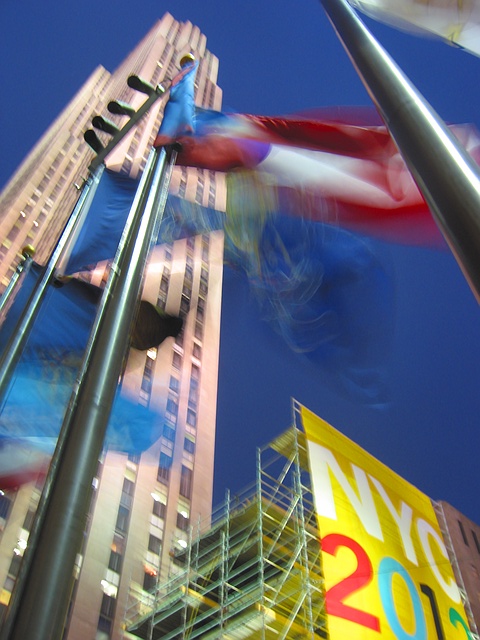
sorry - didn't have my tripod w/me that day and it was completely dark when i took the photo (the area is pretty well lit so its hard to tell what time it might be from the photo)
Statistics
Place: 65 out of 147 Avg (all users): 5.3529 Avg (commenters): 6.2333 Avg (participants): 5.1538 Avg (non-participants): 5.4762 Views since voting: 1211 Votes: 272 Comments: 32 Favorites: 1 (view)
for all your votes - thanks! i took this photo when i was showing my cousin around NYC, it was night time, and i intended to return w/my tripod but time and weather didn't permit me to. i really thought this was my weakest photo that i had submitted here but i did better than all the others. . .
i really appreciate all of the comments (except the idiot who said 'patriotic crap' because 1) olympics are very international 2) you don't know that the flags are the US state flags, it could have been flags from around the world and 3) patriotic crap makes front covers of newspapers and magazines). i recognized the shortcoming of the photo before submission but unfortunately the system doesn't allow us to tell something about taking the shot.
i really felt that even with its imperfections (the blur), this photo could have been a small photo accompanying a newspaper article on NYC's efforts to win the olympics in almost any paper (assuming they also didn't have time to return with a tripod), and given its obvious weaknesses I'm happy that most of you liked it.
Too much blur on the flags for me, and I think the whole of the NYC 2012 banner should have been in shot as that would appear to be the point of the photo. Otherwise a good shot, the lines of the building and flagpoles are very strong.
This looks like it was shot out of the window of a moving cab. It is really not very clear. The big NYC sign should really be the center of attention here. This has the potential to be a decent photojournalism shot, but in this condition I don't see it making the paper. - Inspzil
I'm sure this breaks more rules of photography than it sticks to, but I like it. Strong vivid colours and a nice use of motion blur. It's a shame that the top of the building isn't a little more in focus.
Very nice, excellent saturation of colours and good movement. Would have maybe worked a bit better with less motion blur on the buildings, but it adds motion and excitement as it is. Top 5 this week from me.
The mood and the spirit of the event is so well captured that it makes you feel as the games have already arived. The colours, use of slow exposure, the bluriness, and the clear blue sky are great. The one thing that would make it even more appealing to me would be a bit lighter shade of blue in the sky. Excellent work, very well seen; thank you, and good luck.
Though I rarely ever see a newspaper picture with an element that's out of focus, this is something that could definately make it on a magazine. I think the composition is great and the blurred colors of the flag create a paintery effect. Highlights are slightly blown on the poles, but I have no idea how to avoid such a problem. Well done.






 Add photograph to your favorites
 Add photographer to your favorites


