Just because a face is painted black it all of a sudden is offensive and directed towards history? GIVE ME A BREAK. Thats whats wrong with North America, if you do something remotely wrong, you are a terrorist/racist/pedaphile etc......im offended that people would be offended at such a thing.
Everyone can be offended about something at any given time... Don't worry about it :) I think it's a cool image also. As you notice, none of the people who are offended bothered to elaborate on why they are offended. They probably can't because they aren't really offended. People who get offended easily are opportunists and generally looking for the chance to be offended :)
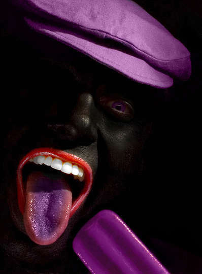
First, this is a great photograph: composition, color and controversial. As art, I completely appreciate its merits, both positive and negative.
That said, it is completely understandable how some would find it offensive given our nation's (United States) history; and, therefore, reminiscent of Minstrel shows. I mean, even I -- an immigrant to the U.S. -- can comprehend the complex issues that such an image can raise. And, frankly, that some either refuse to understand or are willfully ignorant of such concerns is irresponsible, and appalling.
Congrats on your top 10 - superb image with great colour and contrast. I gave it a 10 during voting and I would give it a 10 now. I didn't bother entering into shallow discussions in the current forum thread about whether or not this is offensive and I find the notion completely out of context and made from sheer ignorance.
There is absolutely nothing offensive about it (and we have our fair share of racism here in Australia) - pure art. Extremely well done and an image to be proud of.
I honestly dont know how some people found it offensive.
Dont "people of colour" eat ice blocks?
Would it have still been offensive if the model was white, and the photographer had just done a Heida and used to burn tool to remove the colour from everything except the popsicle and the hat and whatever else?
Somehow I'm reminded of the Rocky Horror Picture Show! Nicely done -- and to those that found it offensive -- I think you need to revisit what is truly offensive in this world; and there is plenty to choose from. This, my friend, ain't it though. This is just art. The black was clearly chosen to deemphasize everything but the mouth, hat, and eye (and popsicle of course) -- no other reason.
That being said -- the shot is scary -- just like in the Rocky Horror Picture Show! I SEE LIPS!!!
I think some people's pants are wound a little too tight. I don't see how this could be seen as offensive. It is very unique and creative. The detail in the face (skin texture, clarity of the eye) all add up to make this a 10 all the way. Knowing this is a self portrait makes me want to give it an 11 or 12 if that were possible.
Wow Kevin, you really stirred 'em up didn't you? :) I think it's a fantastic photo, and it really should have received the blue ribbon. If it wasn't for a few "Oh-I-just-need-to-act-soooo-offended-so-people-will-think-I'm-a-good-person" types, then you probably would have. Way to go! True art!
Hey congrats on your top 10 entry!
I found this picture to be original and cool
It reminds me a bit of the 80´s
I think the composition is great and lips are perfect
only thing that could have been better was maybe to have the eye a little brighter
cause I see it is purple and could have worked better birghter I think
Anyway I really cannot see what can be offensive about this?
I think most people agree with me cause it got in the top 10 didnt it :)
Keep this stuff up I can´t wait to see more of your entrys :)
ok, it took me all night, but i finally figured out what this image reminded me of. as i mentioned before, first impressions were of a weird al jolson spin, but giving the photographer the benefit of the doubt, i looked at it for quite awhile, and knew that it reminded me of something else--something about the vibrant, almost electric quality of the colors...and it finally hit me this morning. it reminds me of the old twizzler commercials, with the mouth and nothing else.
the first thing that popped into my head from the thumb was an impression of al jolson. but the more i look at it, it's just really cool! i like your style--quirky and interesting. i'm looking forward to seeing more of your stuff. :)
Very cool photo and great title. I love the effect of the rich colors against the black face and background. Teeth are brightly white and only thing I think would have addes some more impact is the whites of the left eye showing more. A brillant concept that was well executed and is going in my favorites list. Wish I could give more than a 10.
Call me crazy, but for some reason I find this picture kinda disturbing. Just out of curiousty, what made you decide to paint ther face black? I think a natural looking face would have been much better and I personally would have scored it higher. But, gotta give it to ya for being this daring knowing "out of the box" shots don't do well here.
Way cool. Just the perfect amount of light on the face. Composition is extremely effective. Teeth may be a bit too white, but I expect that is due to the dark areas in which they live. I think I hear the ribbon train heading in your direction - listen for the whistle.
Wow! This really pops (no pun intended). Great idea. On my mac I can see details in the face and that works well for me, better than it looked when I first looked on my PC. I'm upping the rating I gave this to a 9.





 Add photograph to your favorites
 Add photographer to your favorites


 Photographer found comment helpful.


