Hello Juan, don't wonder why you get this critique a bit late, but your photo was assigned to me in context of the Critique Club (maybe you read about that in the forum). So here it goes:
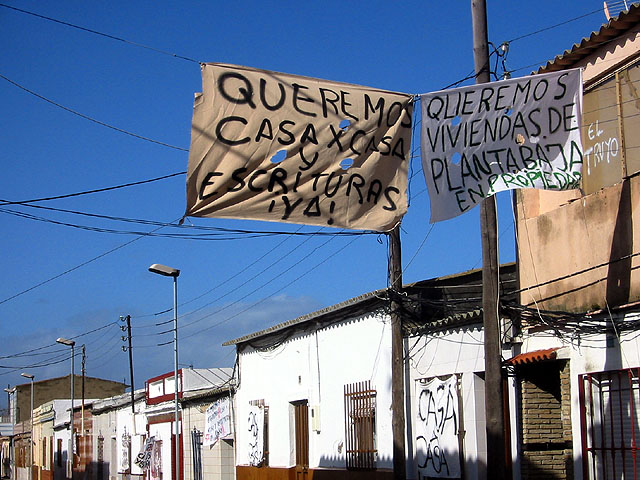
Composition: Normally I like "simplicity", i.e. photos which aren't crowded with many different things, one distracting from the other. But in this case I like the chaos. The many different houses, all looking a bit "patched" really make the photo. And when I read the title I immediately knew what kind of story is behind it.
I like the angle you used and how you used the perspective to align the houses in a row and make them disappear in the background.
I don't know how the photo would look when showing a bit of the street, but I imagine that if it was a dusty road maybe with some litter around, that it would add to the photo.
Lighting: You had good lighting conditions. The light was bright enough so that you could use a fast shutter speed and a narrow aperture. I think the shadows on the bottom right of the photo distract a little because everything else is very bright. When I look at the photo as a whole, the bottom right somehow looks like a "blind spot" to me. The blue sky is nice, because is a good contrast to the banners.
Focus: I like that you used a fairly narrow aperture so that there is still much detail in the background and a lot of things to see. I understand the photo that way that you wanted to photograph the whole scene and the banners are not your subject. So a wide DOF makes sense here.
The banners look like they flap in the wind but because of the fast shutter they are still sharp and don't have motion blur. This adds to the feeling that you "froze" the whole scene.
Art: Like RiderGal already said, a human aspect would have made the photo even better, but I know that this is difficult. Overall I like the photo and it fits to the challenge very well. I can definitively see it as a photo to a story in a newspaper.
Thanks for your commentaries. The photo tries to reflect a claim, of most underprivileged of the city. They constructed their present houses and the public administration supply to live to them in blocks of floors in rent, demands house in ground floor and property.
unfortunately, i don't know spanish. i feel id's probably get the photo a lot more if i knew what the signs said and what the cause was. something about homes for writers? i hope it says in the description. i'll come back and look when the voting is over. overall it's a great shot. composed well, and the lines are interesting. and the colors really set a scene. 8.
I don't understand what your picture is trying to tell me. Are these homes about to be destroyed. Are they advertising them for sale? Guiess I'll hve to read the article to see, and I will. Good photo, Bright and clear. Good composition with nice execution. Just with your title told me a little more. PTL8
One of my higher scores this week. I would like a different angle that showed more of the streets. Sometimes it will help to even just hold the camera up in the air as high as you can to get a little different perspective. It isn't always possible tho. Fits the topic well. 8 ~indigo997
Composition: Subject Placement, Cropping, Background6, Technical: Focus, Exposure, Lighting, Processing6, Appeal: Is it Interesting, Motivating, Etc.? 7, Total Averaged Rating6. Autool IMO the relationship between the title and picture are key elements in this challenge. You have probably cartured a great story here, but due to my ignorance I missed it. I would have liked to see a portion of the street, which would have added a line to tie all of the houses together. Good job.







 Add photograph to your favorites
 Add photographer to your favorites


