Author Thread Comments Made During the Challenge
Post actions
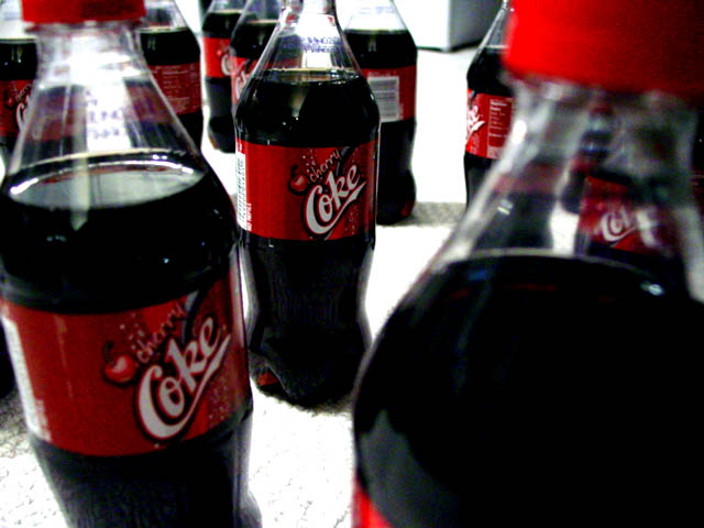
Sharper focus on left bottle woud've added a point to my vote - I like it.
Post actions
This seems rather derrogatory for advertisement. A surplus suggests people aren't buying the product. It's a rather random looking composition although kind of interesting in a weird way.
Post actions
MMmmmmm....my favorite... could use one right about now! Good take on the challenge. :o)
Post actions
I like the title and the idea, but photo seems too dark.
Post actions
None of the Coke bottles are in good focus, and the brightness levels seem off. I do like the arrangement of the bottles in the photo, though.
Post actions
Unless you have a low end camera, I'd save the picture at a higher quality. Getting rid of the jpeg artifacts would help a lot.
Post actions
there is an edge of something up in the top middle. this image is also way too compressed. more definition would increase the score of this photo
Post actions
Kind of grainy, but it's still somehow appealing to me! (10)
Post actions
Too contrasty. I would want my product to sparkle. These look a little scary.
Post actions
Too much blur and strong highlights. Also I don't think the bottle on the right front is helpful to the image.
Post actions
This is a good idea, but I'm not really finding a strong focal point. Perhaps a different arrangement, and really emphasize the label?
Post actions
Post actions
This is a great image, only a 9 due to an overwelming bottle on the right.






 Add photograph to your favorites
 Add photographer to your favorites


 Photographer found comment helpful.


