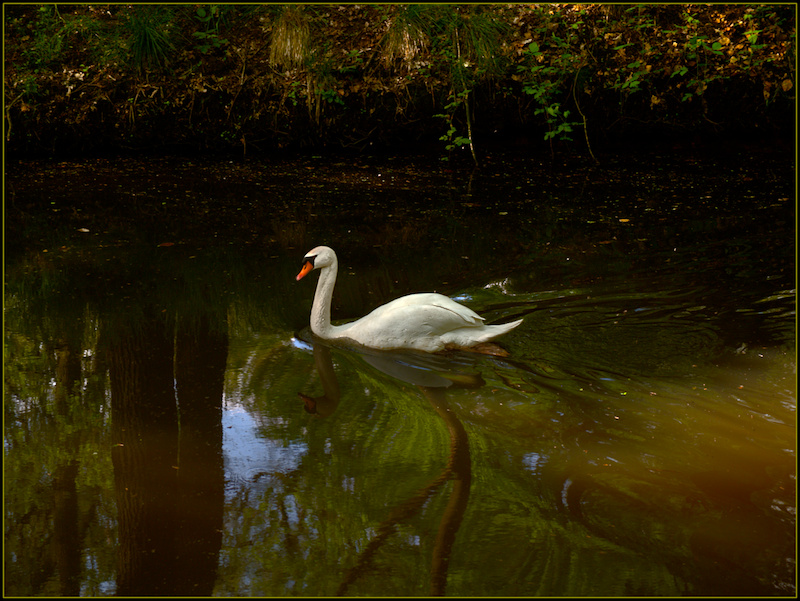
I really like the colours and reflections in this shot. I would consider cropping a little more off the top to just above the darkest part of the shoreline, if it were mine.
Marking this so I can come back to it latter. I will also check it on my calibrated monitor at home as well but for a quick first impression which is how most people vote I would say I would have given this a 4 or 5. I will come back and give you a more detailed response but the first impression is the swan is very small and there just seems to be too much open space with competing textures. To be continued soon.
Ok so on my calibrated monitor it looks fine. A bit dark on the one I use for printing but nice exposure on my one with the tools and all on it. I think it really just lacks the wow factor so many look for and expect on a free study. A closer crop utilizing the reflection would help with that. Is it a 4 or below shot? I dont think so but when you do a free study the voting is a bit harsher. As it is now there just seems to be too much open space around the main subject and the bank is, well I would prefer more of the bank or none of it. he exposure and sharpness on the swan is excellent but is also lost in the shot, again a closer crop would help. Best of luck to you.





 Add photograph to your favorites
 Add photographer to your favorites


 Photographer found comment helpful.


