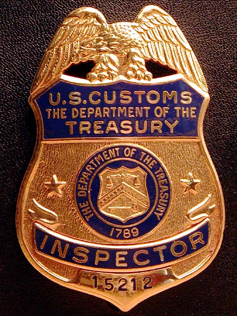
This is a pretty good idea. I wasn't sold on it by the thumbnail, but here it looks ok. I'm not overly wild about it either. The light seems a little harsh at the top and a little lacking on the rest of the pic. Aside from that, I think it looks pretty well focused and framed. It might be going a bit uphill from L to R but I don't think its that significant. - Inspzil
There's a little bit of glare that I would have tried to eliminate. I like the badge, but some perspective of it being worn, or showing it with a silhouette of its wearer, or something to give some depth. The shot is really flat, especially for a macro. 7 nards656
This does look like something that would be in a newspaper -- great idea! The lighting on the top is a bit harsh -- the eagle is somewhat washed out. More even lighting would make this a much better-looking setup shot. muckpond
Congratulations on your new position. I'm assuming, that with this so new, if you have one of these badges it's becaue you're part of them. Also congratulatoins on a great photo. It's very clear, well framed, great color, good focus, etc.,etc. In other words, it's a great pic. Way to go. PTL9
Nice lighting, DOF,seems to be some jpg artifacts in the blue areas of the badge. Lighting is a bit harsh on the eagle at top of badge. Nice job of a close up, though!





 Add photograph to your favorites
 Add photographer to your favorites


 Photographer found comment helpful.


