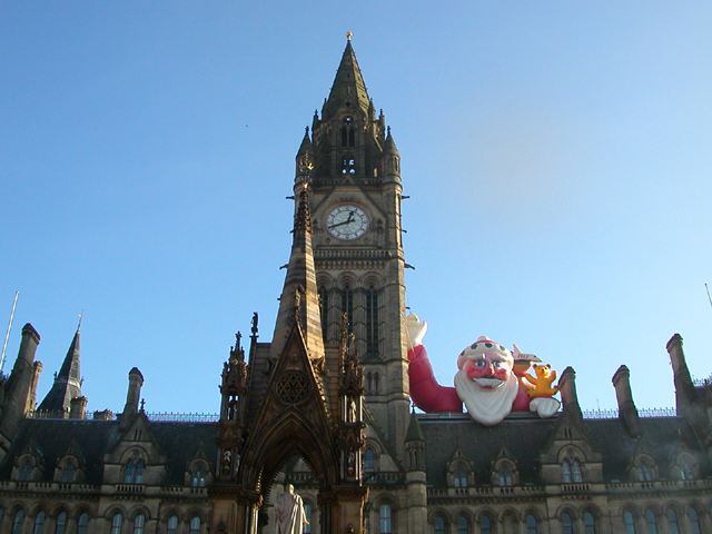
Composition-Content I loved this picture, the title is great and is really tells the story. I think that cropping a bit off the right of the picture would have helped, would have placed the tower at a "rule of thirds" point. This would also have made Santa appear larger in the frame. I would also have like to have seen the bottom of the statue, so pulling back a little would have included this. At the moment, the tower and the Santa are vying for attention.
Background The other main point of the story is the blue sky and this has been left nicely clean with no distractions behind the tower etc, so strengthens the overall impact.
Camera Work-Technical There is some distortion at the ends of the frame where the building appears to curve up, has a slight fish eye effect. More cropping or moving back could have got rid of this. As a said before, I think a closer shot of th tower and Santa would have been good. I also like the idea of making a vertical shot and then these problems would have been helped. On the right frame of the building there is some glare from the sun, so maybe shooting at a different time of day would have got rid of these and also added a bit more colour to the Santa.
My Opinion I loved this picture, made me laugh. I used to live in Middlesbrough, so I know how rare the sun can be up there! The picture fit the topic well and I can imagine this being used in a local paper. Great Picture! Hope that this helps!
Manchester? You soft southern b******! Greetings from oop North (Chorley!). I think ignoring the tower and tilting the camera down to get the front of the building in frame may have been a better shot but Santa is throwing off my sense of scale so I may be wrong.
Nice photo! Looks a bit surreal the old church (?) with the funny santa claus on the roof :-) You had good lighting conditions and the clear blue sky looks nice as the contrast to the red santa. I think the composition could be better. The spire cuts the photo into two halves. The right half contains the actual subject and is interesting. But the left half is a bit wasted because it adds nothing to the photo. I would have tried to move some steps to the right and also a bit nearer. -stephan
LOL. That's pretty funny. Is there some wide angle distortion here, or is it just perspective issues? I wish the lighting had been better for this shot, but your focus and clarity seem to be ok. Maybe having taken this at a different time of day would have helped the lighting problems. The detail on the front is wiped out by shadow, and santas colors seem a bit dulled, with a couple hot spots. Overall, definately news worthy. good luck in the challenge. ~Heather~
i'd bet if you'd taken a long rectangle instead of a short one you coulda got some foreground, ground level stuff with people in it. nice thing about taking a picture of a clock, you can totally see what time it was, know when to go back to get that nice sunshine.
From what I hear the sun is almost as rare as santa there. Cute idea, neat composition and good execution. You pulled one off here and I'm not quite sure how, but it worked. Nice, clean, clear, crisp photo. Good job. PTL7
Composition: Subject Placement, Cropping, Background6, Technical: Focus, Exposure, Lighting, Processing8, Appeal: Is it Interesting, Motivating, Etc.? 7, Total Averaged Rating7. Autool IMO the relationship between the title and picture are key elements in this challenge. Both a rare occasion I am sure! Good job.





 Add photograph to your favorites
 Add photographer to your favorites

 Photographer found comment helpful.


