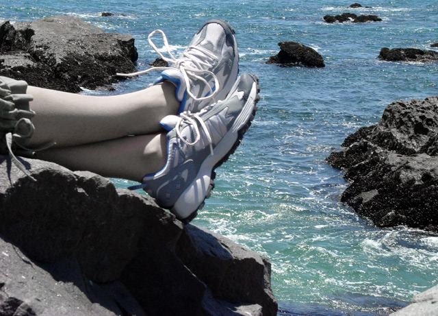
I had to hunt for the Nike logo. The more prominent shoe is showing the inner, which doesn't have it. Would have been great, otherwise. I like the muted colors and the match between shoe and water.
Sneakers are a bit blurry, and the skin on the model seems lifeless - very gray. Is Nike's phrase "Just do it" intended in this advertisement to mean go on a vacation, or go snorkeling?
The shoes look to be a little blurry on both computers. The pastey white legs also throw a greenish hue into the picture that is unappealing. If your advertising a product it is always advisable to show the label or symbol such as the Nike swirl to make the product stand out so people remember what they were looking at. Beautiful background tho.
this would be good, but you can hardly see the nike signs on the shoes. lighting with less shadows and that doesnt wash the color out would be better too.






 Add photograph to your favorites
 Add photographer to your favorites


