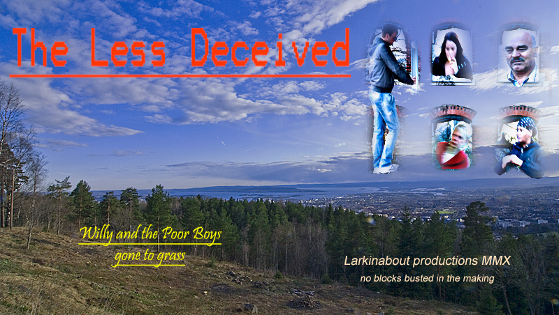
I like the background photograph used but the design execution is holding this entry back and you didn't do yourself any favors with the voters by going with an unconventional poster orientation.
However that said, I don't think you are that off from a good entry. The images in the right corner just need to be masked better with some sort of back drop or white space to rest in. Also, the font used in the movie title isn't good. Almost anything would have been better than that pixelated font used. |






 Add photograph to your favorites
 Add photographer to your favorites

 Photographer found comment helpful.


