This is the original movie poster that I parodied:
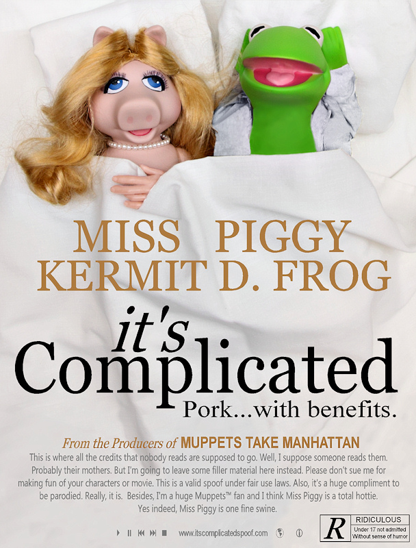
Had some difficulty getting Kermit's position looking similar to Alec Baldwin's in the real movie poster. It was hard to position his arms behind his head and that aspect didn't work out as well as I wanted. Didn't have a white pajama top for him either and that took some color changes to the shirt he borrowed from G.I. Joe. I'm very pleased with the remainder of the poster.
Anticipated critiques:
-Kermit looks awkward
-You are a sick puppy
Post-challenge notes:
I'm very pleased to have another of my humorous entries on my profile page. I knew I was on the right track when I posted my initial camera work in the team thread and MattO's response was "This is wrong on so many levels". Didn't think it could come in this high until it kept climbing. I was on the edge of my seat all week.
Statistics
Place: 5 out of 215 Avg (all users): 6.9618 Avg (commenters): 8.5000 Avg (participants): 6.8161 Avg (non-participants): 7.1429 Views since voting: 7136 Views during voting: 456 Votes: 157 Comments: 45 Favorites: 5 (view)
Taking some time out to leave some comments. Congrats Steve on the top 5 placement! Love all the details you put into this piece right down to the small type; the details propel this above average shot into the excellent top notch. It made me laugh - love the humor. The lighting and pose of your main subjects is just spot on perfect. Excellent work!
shared my top vote - great all round - wish I'd had time to say more than just 'funny' during the challenge but it's all been said for me now anyway. cheers.
This is too funny. Well done, although a little blown out near the top. And I'd have used the skinny font for your credits paragraph. Rated R - too much!!





 Add photograph to your favorites
 Add photographer to your favorites


 Photographer found comment helpful.


