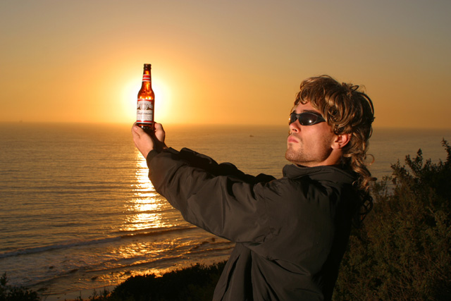
Looks more like advertising that photojournalism. Not a bad pic really, The reflection in the sunglasses is not good. Were he facing the sun more you could get away with it. Without the glasses would've yielded a better pic just because there would be no reflecion of the flash. - Inspzil
Advertisement! I love the shot. Biggest problem - can't read which beer is the king of beers. In advertisement that's very important. Maybe zoomed in some and did away with more of the side and we could read the beer brand. As a photo it is beautiful. As an advertisement it falls short. But the photo is A1 in itself. But I must score it as a total unit. PTL5
The exposure on this is awsome considering that it is backlight with the sun. Nice work. I almost think the pose would seem more natural though if he were holding the bottle with one hand instead of two. Of course, you may not have wanted natural! Nice colors as well. karmat
I think this misses the theme a bit. Sure there are advertisments in journals, magazines and newspapers but the photo should be representative of what you'd find in the actual articles/cover of the magazine/newspaper.
This would have been a winner in an advertising challenge! Interesting idea and great color. But for photojournalism, well, it just doesn't do it for me.( I have to ask, is that a wig or his real hair?}
He's a hotty! He's also got really small hands.... Maybe it just looks that way. I love the concept, the shot is clean, in focus and interesting. Over all it's pretty nice work. Justine
I hope you received some remuneration from the company? My interpretation of the challenge is photos should be or at least look non staged. (Journalism)





 Add photograph to your favorites
 Add photographer to your favorites


