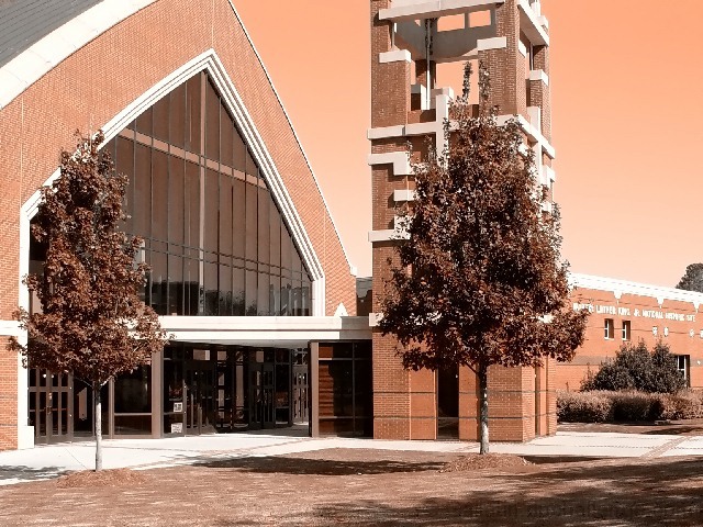
What jumps out at me immediately is the sepia tones. I don't mind sepia but I don't think it fits with this photo and particularily for the Photojournalism challenge. Photojournalism seems to be about capturing the truth, presenting something the way it really is and not about creating something artsy. I would have chosen black and white if you didn't want it in color. It is a nice clean shot but I would have preferred to see a little more of the left side of the building or a straight on, dynamic looking shot. The second thing that jumped out at me was the lack of a story or message. This could be done by showing people in the photo. Maybe you would not have felt comfortable shooting this when people are coming or going but I think it would have given the photo some life and a purpose. It's not a bad shot but I feel it needs something more to make it more striking with something to say.
Would have been great picture if it had been left natural color - green grass and blue sky. Good focus and nice directional shot. Really missing color. PTL6
I really like what you've done with the colours here. Makes the trees look a little wierd, oh and the sky, um and the grass. Seriously though, nice shot, great composition and once again excellent colour.
The coloring is really distracting on this photo -- it really takes away from the overall effect because it is so harsh. The photo also looks overly-sharpened or poorly compressed -- look at the lines in the windows above the doors and the text on the building. If this isn't sharpened, make sure you change the color mode to RGB before resizing or else it will cause those jagged lines. muckpond
This is a gorgeous picture really but there are a couple things that are sort of odd and could be improved upon methinks. First, the sky is some funky color. I don't get that part of it at all. It obviously is not natural unless this day happened to be armageddon, but I think if it was, we'd have known that before today. The other peculiar thing that I think isn't consistent with photojournalism, as I understand it anyway, is that the name of the building is not as clear and readable as it should be. It would've been a little better to get at least the top of the main building in view but it isn't making or breaking the pic. The tower, well you might have to pan out considerably to get the top of that, so it's of much less importance (I don't know how tall it really is). Good luck. - Inspzil





 Add photograph to your favorites
 Add photographer to your favorites


