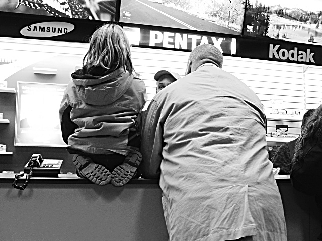
(1) COMPOSITION (CONTENT) - Pretty good. I’d like to see the partial bodies on the right cropped out. The problem with that, you lose the Kodak sign. Can’t win. I like the partial face in the center, although a couple of folks did not. It’s good that he is looking at her. I like the pose of the girl, kneeling on the counter. Definite youth, paying attention. (2) BACKGROUND – Pretty good, but two “blown out” areas are distracting – left of the girl’s arm, and right of her head. Looks like bad reflections. Overall background is also a little too bright, but probably hard to change in b&w. (3) CAMERA WORK ,TECHNICAL – Focus and DOF look quite good. (4) DIGITAL PROCESSING ,TECHNICAL – I assume you took this in color and converted to B&W. The conversion looks good to me. Good resulting textures. No recommended changes. (5) MY OPINION ON THE PHOTO – When I first saw the photo and the title, I had trouble envisioning the story that went with it. A good picture, but “so what”; why would this be on a front page or a magazine cover? On the other hand, it would go well with a story on a “variety” page that covered a young girl who took photos for a school paper.
I hope they bought the kid a camera! Interesting use of high-contrast B+W helps focus on the characters/story rather than the advertising, while using the displays to provide context.
i like the salesman's eye. the far wall below the brand names is a little blown out, wonder if that's what had to go if you were gonna get the wrinkles on the jackets or the details of their hair. real nice, kinda wonder why you chose black and white though, 'cause there looks to be a lot of color here.
More of a candid than true PJ, but I'm not knocking points off for that this week. Too much reflection behind the sales counder, and the pic doesn't have much of a real point to me. Sorry, good luck! 5 nards656







 Add photograph to your favorites
 Add photographer to your favorites


