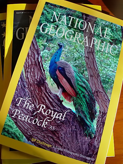
I took a DPhoto of a male peacock in a local bird zoo last Wednesday the 20th, and fabricated a 1 to 1 imitation of a National Geographic Society magazine cover with it, with PSP 6. Then I printed the .jpg image on HP Premium Photo paper, cut out the white edges and pasted it on top of a real NGS magazine, put it on top of two other issues over my desk, and using natural light coming through the window I photographed the setting.
Statistics
Place: 74 out of 147 Avg (all users): 5.2757 Avg (commenters): 7.1304 Avg (participants): 5.2170 Avg (non-participants): 5.3133 Views since voting: 1292 Votes: 272 Comments: 25 Favorites: 0
Hello Aldo, don'twonder why you get another critique this late,but your photo was assigned to me in context of the Critique Club (maybe you read about that in the forum). So here it goes:
First of all I want to say that it's a bit hard to critique this photo. It's a photo of a photo and as such I won't critique your (very nice) photo of the peacock but the photo of the magazines.
Composition: I like how you used several NGs and the way you placed them a little bit rotated. This makes them look like an ordinary pile of magazines on your desk. To make it look even less staged you could have zoomed out a bit more and shown one or two objects which normally lie on a table, e.g. a pencil or something like that. But I guess you wanted to show as much of the cover as possible.
The dark edge of the table in the upper right corner is a bit distracting. I also think the photo would look better with a bit more space on the left side like on the right side.
Lighting: The light seems to come from the lower right. I like how it creates some shadows giving the photo more depth and making it visible that this is a thicker magazine and not just a sheet of paper. But I think there is a shadow in the lower left corner which is probably you standing before the light source. This makes the cover of the front magazine a bit unevenly lit.
Focus: All is well. As far as I can see everything of the front magazine is in focus.
Art: Maybe it sounds a bit nitpicking but I don't think the photo fits to the challenge. The photo of the peacock would, but the photo of a magazine showing the peacock does not. However, fulfilling the challenge is only one or two points on my scoring scale and considering the high creativity and fun factor I still think it's a good photo.
Witty and good photo. I received my first issue as a subscriber just this week. Your photo is just the sort of thing I'd be happy to see on the front cover. 8, Kavey
A clever idea well done. To me, it straddles the line between fair use and infringement -- as a personal project or parody it should be OK, but I wouldn't suggest trying to sell any reproductions...if the peacock photo is your's you'd be better off using a similar name, something like "Natural Cartographic" which would suggest but not copy...
That cover photo is a great photo. Did you take it, or was it really a NG cover? I have a hard time voting because of that question. If you took it, it really would be great PJ for a mag cover based on the article title. If, however, you simply took a shot of an existing cover, it would only be a picture of a magazine. I see the DP Challenge line, so I suspect it's your shot. Thus, I'm giving you some benefit of the doubt, but because you haven't shown this to be your shot, I'm taking a couple away. Fair enough? 7 nards656
Obsession is right! I like the colors on this, and teh lighting works well. However, your crop leaves me feeling like it is a little flat. Maybe some kind of different perspective would give it more feeling of depth. karmat
Congratulations for making the cover! Very cool idea and well executed. The picture of the peacock is nice, good pose of the bird and good texture of the tree. The piling of the magazines is a nice detail.
Great idea. Looks too faked - something abut the way the peacock is on the tree. Too much greenery in the background - almost hides the bird. Good composition just needs better execution. PTL6
Nice clear shot with good lighting, and I like the composition. The shot of the peacock is actually quite nice!! The shot on the "cover" of the NG is definitely photojournalism, but is THIS shot photojournalism?? lhall :)





 Add photograph to your favorites
 Add photographer to your favorites


