Author Thread
Post actions
I love this. I think the sky is perfect.
Comments Made During the Challenge
Post actions
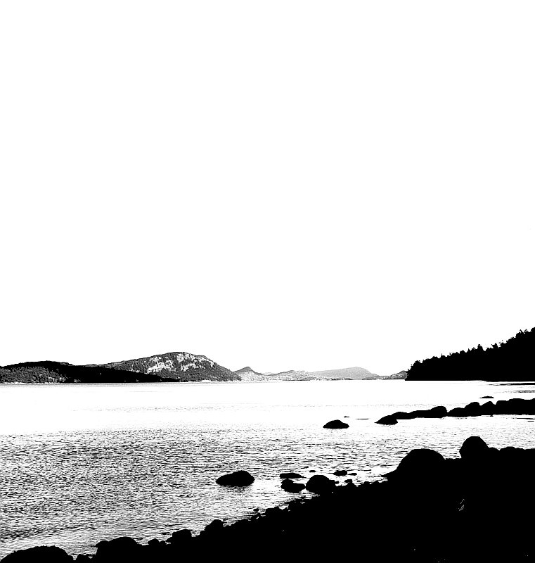
I like the negative space but the contrast is way too high imho.
Post actions
At first I really didn't like the extremely black areas, but I decided it's very interesting because of the really white areas and the composition.
Post actions
Very nice use of high contrast, in my opinion.
Post actions
Too blown out for my taste in the light areas and not enough detail in the dark areas.
Post actions
Too contrasty. I would have liked to see more levels of gray, compared to the white sky and black foreground rocks.
Post actions
nice shot, if the sky were a little smaller it might accent the coast a bit more?
Post actions
I think there's too much sky with no discernable detail, which could be cropped and shorten the image by half, and it would still be interesting.
Post actions
the sky and the water seem to be blown out
Post actions
for me this sky is way to bright/blown out, and the land is way to dark/lacking details
Post actions
IMNSHO, this would be a much better shot if you cropped out a lot of that big, blank sky. Also, a large part of the water is blown out.
Post actions
This looks like beautiful scenery, but much of it is lost in white....a little bit of gray would help bring out those details. Maybe too much contrast?
Post actions
38 Comments side challenge:
Post actions
I don't like the super high contrast edit here. You clearly have an artistic vision and know what you're wanting, the result is just something I don't find personally particularly appealing.
Post actions
A bit over-done with the contrast for me.
Post actions
A little too over processed and blown out but, has an artsy look to it
Post actions
humm little over lighted??






 Add photograph to your favorites
 Add photographer to your favorites

 Photographer found comment helpful.


