| Author | Thread |
|
|
05/06/2010 11:08:43 PM |
|
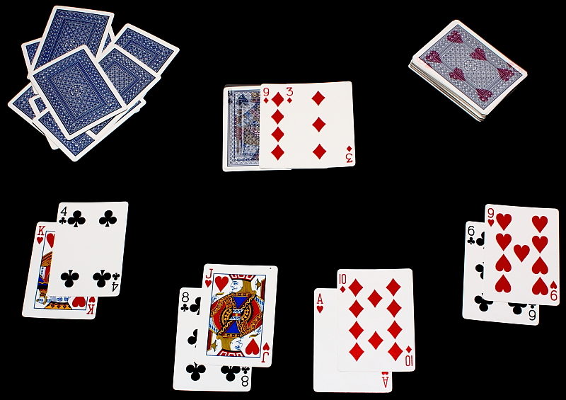
Here is a case that I would cropped much tighter to force the eyes into the main theme. However, the concept is striking. |
|
 Photographer found comment helpful. Photographer found comment helpful. |
Comments Made During the Challenge  |
|
|
05/04/2010 11:13:17 AM |
|
| Photographer found comment helpful. |
|
|
05/04/2010 10:30:16 AM |
|
| Photographer found comment helpful. |
|
|
05/03/2010 04:21:19 AM |
|
| Photographer found comment helpful. |
|
|
05/02/2010 10:37:14 PM |
|
If this was only true - great concept |
|
| Photographer found comment helpful. |
|
|
04/30/2010 01:34:50 PM |
|
Interesting idea. IMHO you could have used a looser crop and I would also get rid of the upper left pile of cards as it's making the photo too simetric. |
|
| Photographer found comment helpful. |
|
|
04/29/2010 12:29:26 AM |
|
| Photographer found comment helpful. |
|
|
04/28/2010 11:00:45 PM |
|
Simple idea, and nicely executed! |
|
| Photographer found comment helpful. |
|
|
04/28/2010 02:59:36 PM |
|
kind of difficult to see the particular card in question |
|
| Photographer found comment helpful. |
|
|
04/28/2010 11:41:47 AM |
|
now no one is going to play with you. great idea and fine execution. less could have cleaned up the comp though. |
|
| Photographer found comment helpful. |
|
|
04/28/2010 06:17:29 AM |
|
Nice idea and well executed |
|
| Photographer found comment helpful. |
Theme:
Classic /
Light /
Dark
Home -
Challenges -
Community -
League -
Photos -
Cameras -
Lenses -
Learn -
Help -
Terms of Use -
Privacy -
Top ^
DPChallenge, and website content and design, Copyright © 2001-2026 Challenging Technologies, LLC.
All digital photo copyrights belong to the photographers and may not be used without permission.
Current Server Time: 10/14/2026 02:43:30 AM EDT.





 Add photograph to your favorites
 Add photographer to your favorites


