|
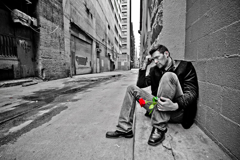
I like colour popping when done well, but I'm afraid I'm not so keen on this one. If the red and green were a little more subtle I think it would be a much stronger picture. As it stands they immediately drag the eye down from the model. A hint of colour there rather than full colour would be better in my opinion. Also, the desat was not specific enough - there are stabs of red still visible on his knuckles, nose, hairline and ear which I find really distracting. |




 Add photograph to your favorites
 Add photographer to your favorites


