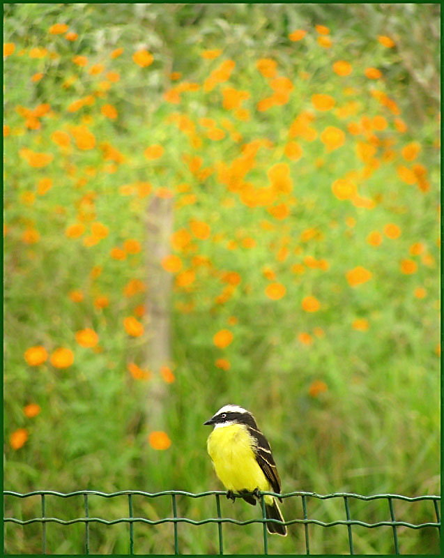
I'll probabbly get punished by the fence where the Bem-te-vi (famous bird in Brazil) is resting. I'v never entered a Free Study and i'm very excited for this, since there's quite some time i don't participate on challenges. I hope you like the colors and the texture of the bokeh behind the bird. Not a killer shot for Free Study, but a good experience that may be good to share! The title are names from Indigenous languages, i choose those words as a homage for them!
Statistics
Place: 307 out of 394 Avg (all users): 5.1361 Avg (commenters): 5.5000 Avg (participants): 5.1429 Avg (non-participants): 5.1190 Views since voting: 1117 Views during voting: 226 Votes: 147 Comments: 9 Favorites: 0
Personally, I think it's absolutely ridiculous that this scored so low. I think it's a stunning image. I think ursula is right--that it's too contrasty. I'd be curious what would happen if you did shadows/highlights on it in photoshop and took down the highlights a tad to flatten it out. It also would have been 100% better if you were able to shoot to the left so that the bird was in the lower right, instead of the lower center. However, as bird person, I think that it is a stunning shot!
I think you did well with your little camera! The best part is the composition - that to me is very strong. I like the bird all the way down at the bottom like that, with all that lovely orange-green bokeh/background above.
I like the photo overall. I did feel the bird was a bit overpowered by the background, and also a bit too centered. Maybe crop it a bit to have slightly less background above the bird, and a little less of the right side of the photo (so it looks like the bird is looking into the empty space.
Edit: I didn't read ursula's comment before I posted mine, I swear! Glad to know I'm thinking along the same lines as one of the greats :)
The bokeh is alright, except for that one out of focus stick to the left of the bird (and the bird seems to be looking at it - it isn't but the direction of the eyes lead you to that OOF post). I think the background loses effectiveness to the top, where you have the OOF grasses - it's like you're including too much extraneous information. I wish there was a little more at the bottom of the image, possibly a little less at top, and also possibly that the bird would be more towards the right hand side of the frame looking into it, rather than in the middle at bottom.
The light looks to be a tad harsh. Both the bird and the fence are a tad too contrasty at top. The flowers in the background also look a bit too bright to make a truly soft bokeh (notice all the yellow outlines).
In other words, a lot of potential, but possibly a bit better light and more careful composition would improve a photo like this quite a bit.





 Add photograph to your favorites
 Add photographer to your favorites

 Photographer found comment helpful.


