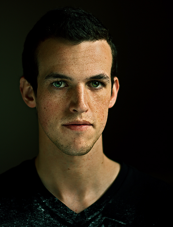
Self portrait. Took a bunch of attempts for the Natural Indoor Light challenge, I thought I picked the best of the bunch for that challenge but found out after that this one was better. It was pretty much blown out but I think I did a good job editing it.
It did good and is my highest scoring Free Study so far! And a bunch of great comments!
Here is the original unedited picture,
Statistics
Place: 133 out of 394 Avg (all users): 5.8811 Avg (commenters): 7.0000 Avg (participants): 5.8190 Avg (non-participants): 6.0526 Views since voting: 1203 Views during voting: 227 Votes: 143 Comments: 12 Favorites: 0
Look into the lens, thru the lens, & right out the other side at all the people you will never see or know who may be looking at this photo someday. Tell them something compelling.
Engage me. I've got no idea who or what you are from this photograph.
The light is nicely used, the natural light effect well done. The catchlights in your eyes are especially nice. Processing is excellent, especially compared with the original (though what you've done with the eyes is over the top in my opinion). Technically, this is an extremely well done photo.
But I feel nothing looking at it. It may have something to do with the rather blank expression, or the straightforward composition, but something deeper is troubling me, I think. This photograph has no meaning for me, other than a fairly literal representation of your face. I usually seek to be engaged in some way with a photo, and I expect an impact above the mere representative, technical kind. There is none with this, superior though it may be in other ways. For that reason, had I voted, I would have given it a 6.
Engage me, tell me a story, however subtle it might be, let me know that you cared about this picture and what it means.
Edit to add: Oh my dear Svetlana, you and I are apparently twins. :-)
this is a beautiful face. i do not see many technical flaws here and besides a lot about the editing has been discussed by other commenters. i do not see any story here though, and this is my only complaint. and yes, the light stuff on the shirt is a bit distracting and the eyes look overprocessed.
what were you going to achieve here? what were you thinking about while taking this? despite having really vivid imagination i fail to read any further story behind this portrait. to me it only says one word, not a poem. the straight composition doesn't add any story either.
maybe only slightly nodding your head would create more natural and lively position? with a face like this you can move mountains :) but only when you first think about where you would like to move them to. without a clear idea and a clear thought in your eyes any portrait is bound to remain flat and liveless.
it is a very good studio portrait, but not much more can be said about it - it doesn't soar. still it is a great start and if you bring more of your life, your personality and your feelings into your self portraits then i am sure you can create amazing unforgettable things:)
edited to add: dear Louis, I knew it :D what a happy family reunion!!
To me, I guess that the final product and the original are completely different and can't be compared...
What I mean is that there was a lot of potential to go with an actual accurate portrayal of the original, but the final product is very stylized. How I would rate it depends upon which you're aiming to accomplish. This, here, is a great stylized image in my opinion. It has a definite green cast to it, but it works well for a stylized portrait.
If I were going with the original and looking at ways to improve, I would think about lowering the keylight and making it have a higher angle (more offset to the right) to make things a bit more moody in shot instead of afterward. It seems as though you've lowered it anyway, so that's something to consider. I tend to underexpose my photos a LITTLE because it seems easier to pull from under than over. As was already mentioned, eyes are a bit over the top, but it works well as a stylized photo.
Consider a rimlight to separate things a bit more, or just hair in general.
Hmmm. Wonder what B/W processing would do with this?
BTW-Looks like you're getting comfortable with that reflector you got yourself. Nice work on the lighting!
nice self portrait, man those are so difficult! this one is good, i just have a few suggestions that I think I would have done differently. The eyes look a TAD bit over processed, it looks like over saturation or too much burning or something around the colored part of the eye.I might have also been hesitant at shooting in portrait orientation, because I think off centered landscape orientation self portraits give more of an impact visually, sometimes i think I get bored with portraits in portrait orientation, but obviously everyone has different opinions! By the way DOF is great, I like that you kept the skin looking natural. All around great self portrait...






 Add photograph to your favorites
 Add photographer to your favorites


 Photographer found comment helpful.


