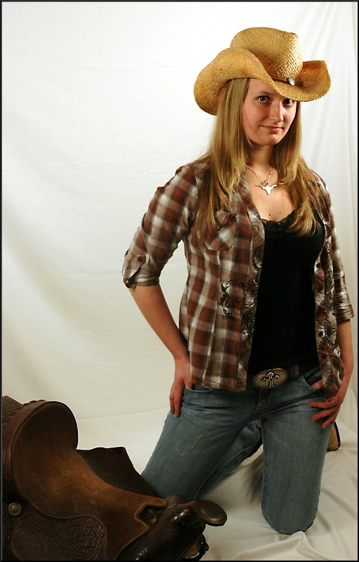
I can see what you were going for here. The thing I see wrong with this is first of all the lighting is just a little off, casting a small shadow beside the nose. The background has some distracting wrinkles. Beautiful model and wonderful pose.
Seeing the folds/creases in the backdrop is a little distracting and perhaps these could have been addressed under the advanced editing rules. I also feel the balance is off a little... perhaps if she her head was angled to the right facing into the frame more I would have scored it a bit higher.
The girl and pose are good, but here are couple things wrong here:
The background needs to be light up more (try a flash pointing to the white to blow it out so you dont see any wrinkles).
Also insterad of using a sheet try a seamless white paper. They sell for like 30 bucks at your local camera store and work much better for these types of shots.
Also, the lighting on her doesnt seem even. Her face is lit up nicely, but the body seems flat. I would suggest a softbox that would lit up the entire body not just the face. And maybe the saddle
Good choice of props. I'm not sure how I feel about the pose overall. I think it's good, but it caused some thingesting lighting, especially around her left eye.





 Add photograph to your favorites
 Add photographer to your favorites


 Photographer found comment helpful.


