I'm going through the entries, stopping at those images I feel have had the benefit of an unconventional eye and dwelling a little longer to try to see and appreciate what you saw. This is one of those images.
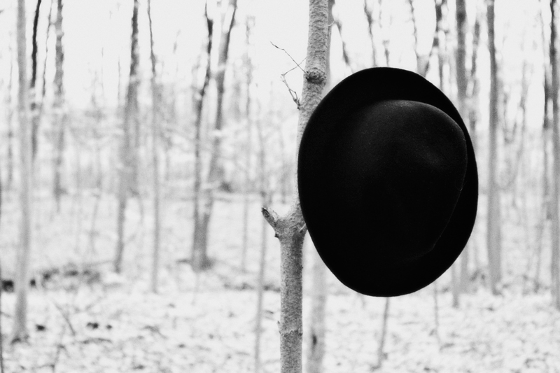
Positives: I do like you concept here - I like a bit of oddness and the juxtaposition of hat and wood definitely offers that. I like your high contrast handling too.
Critical stuff: Not too much really - I like the way the forest is a bit blown, I wonder how it would have looked with a white vignette, I think this may have helped accentuate the look you have started to create here.
I think this might be more effective if somehow there were more subtle tonal contrasts in the hat. Maybe do some dodge on the mid and highlight tones. :)







 Add photograph to your favorites
 Add photographer to your favorites

 Photographer found comment helpful.


